移动端页面高度如何自适应问题
问题:
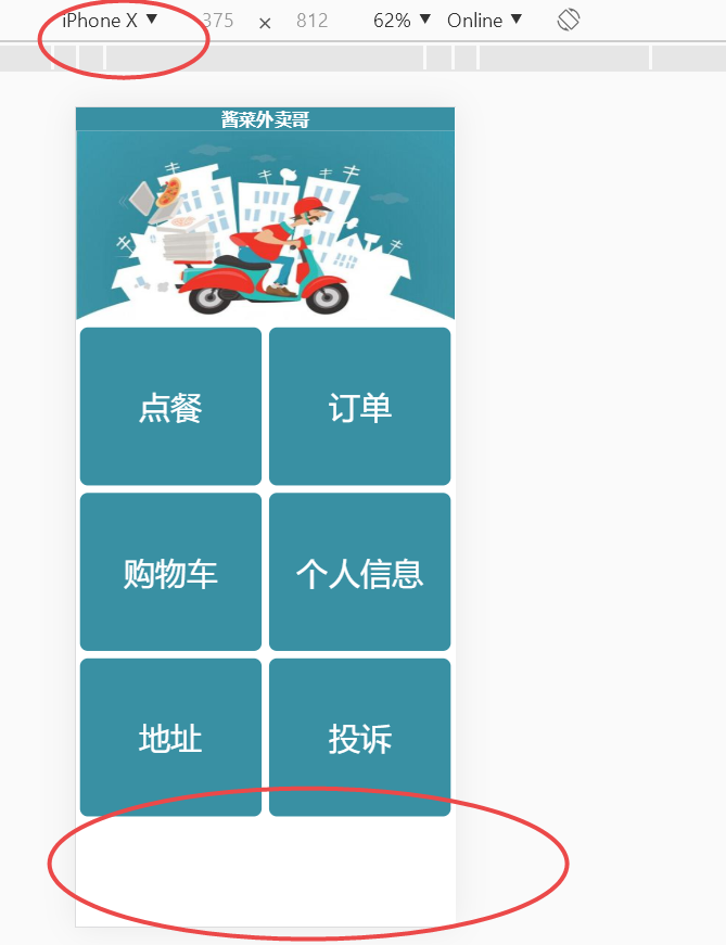
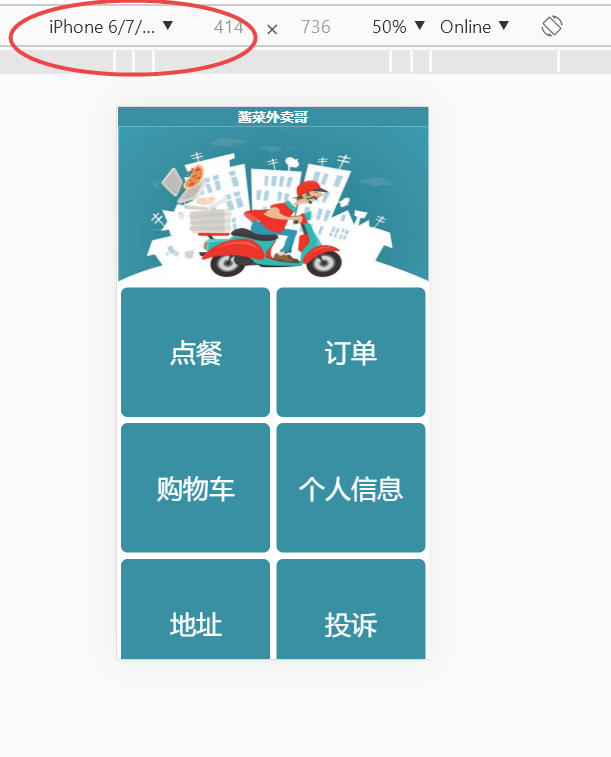
如下图,老师请问在浏览器调试不同手机机型的时候页面的高度不一致,在iphonex的时候页面下面会有多余的空白地方,而在iphone6plus等就不会,如何实现会根据机型自动调整呢?
代码和素材:
html
<!DOCTYPE html>
<html>

	<head>
		<meta charset="utf-8" />
		<title>酱菜外卖哥</title>
		<meta name="viewport" content="width=device-width,minimum-scale=1.0,maximum-scale=1.0,user-scalable=no" />
		<link rel="stylesheet" href="css/css.css">
		<script type="text/javascript">
			//加载时调整网页宽度
			window.onload=function(){
				resetPage();
			}
			//浏览器被重置大小时调整网页宽度
			window.onresize=function(){
				resetPage();
			}
			function resetPage(){
				var deviceWidth=document.documentElement.clientWidth;
				//获取ID为wrapper的元素
				originWidth=document.getElementById('wrapper');
				//获取该元素的宽度并确定缩放比例
				scale=deviceWidth/originWidth.clientWidth;
				//按比例缩放到适合屏幕的大小
				document.body.style.zoom=scale;
			}
		</script>
		<style type="text/css">
		* {
				margin: 0;
				padding: 0;
			}
			body {
				/*background-color: black;*/
			}
			#wrapper {
				width: 480px;
				height: 800px;
				margin: 0 auto;
			}

		</style>
	</head>

	<body>
		<div id="wrapper">
			<!--标题栏-->
			<div class="top">
				<p><b>酱菜外卖哥</b></p>
			</div>
			<!-- 广告图 -->
			<div>
				<img src="images/banner.jpg" alt="" height="240px" width="480px";>
			</div>
			<!-- 按钮列表 -->
			<div class="button">
				<a href="./error.html"><div><p>点餐</p></div></a>
				<a href="./error.html"><div><p>订单</p></div></a>
				<a href="./error.html"><div><p>购物车</p></div></a>
				<a href="./error.html"><div><p>个人信息</p></div></a>
				<a href="./error.html"><div><p>地址</p></div></a>
				<a href="./error.html"><div><p>投诉</p></div></a>
			</div>
		</div>
	</body>

</html>
CSS
/*标题栏*/
.top{
	width: 480px;
	height: 30px;
	/*background-color: grey;*/
	background-color: rgb(57,144,163);
	/*background-color: #6699CC;*/
	text-align: center;
	color:white;
	font-size: 22px;
}
/*按钮*/
.button{
	width: 480px;
	height: 840px;
}
.button div{
	width: 230px;
	height: 200px;
	background-color:rgb(57,144,163);
	/*background-color:#6699CC;*/
	float:left;
	margin:5px;
	line-height: 200px;
	text-align: center;
	border-radius:10px;
}
.button div p{
	font-size: 40px;
	color:white;
}
/*错误页面提示*/
.error{
	text-align: center;
	font-size: 40px;
	/*color:#6699CC;*/
	color:rgb(57,144,163);

}
素材
./images/banner.jpg
14
收起
正在回答
1回答

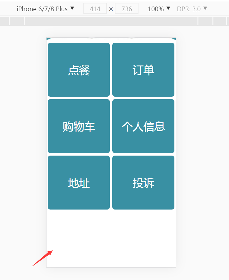
同学你好,在iphone6plus设备中,也会有空白的地方,只是高度比较小,没有展示出来而已,可以滑动一下屏幕,就可以看出来:
不同设备的高度不一样,所以会出现这种情况,不过这种情况也是正常的,如果想要在每个设备下都不出现空白,可以利用flex布局,例如(图片同学改为自己的路径就可以):
<!DOCTYPE html>
<html>

<head>
    <meta charset="utf-8" />
    <title>酱菜外卖哥</title>
    <meta name="viewport" content="width=device-width,minimum-scale=1.0,maximum-scale=1.0,user-scalable=no" />
    <style>
        /*标题栏*/
        .top {
            /* width: 480px; */
            height: 30px;
            /*background-color: grey;*/
            background-color: rgb(57, 144, 163);
            /*background-color: #6699CC;*/
            text-align: center;
            color: white;
            font-size: 22px;
        }
        #wrapper {
            width: 100%;
            height: 100%;
            background:red;
            display: flex;
            flex-direction: column;
            align-items:stretch ;
        }

        /*按钮*/
        .button {
            flex-grow:1;
            display: flex;
            flex-wrap: wrap;
            justify-content: space-around;
            /* width: 480px; */
            /* height: 840px; */
        }

        .button a {
            margin: 5px;
            width:46%;
            background-color: rgb(57, 144, 163);
            text-decoration: none;
        }

        .button div {
            /* width: 230px; */

            height: 100%;
            display: flex;
            justify-content: center;
            align-items: center;
            /* height: 200px; */
            /* background-color: rgb(57, 144, 163); */
            /*background-color:#6699CC;*/
            /* float: left;
            margin: 5px; */
            /* line-height: 200px; */
            text-align: center;
            border-radius: 10px;
        }

        .button div p {
            font-size: 40px;
            color: white;
        }

        /*错误页面提示*/
        .error {
            text-align: center;
            font-size: 40px;
            /*color:#6699CC;*/
            color: rgb(57, 144, 163);

        }
    </style>
    <script type="text/javascript">
        //加载时调整网页宽度
        window.onload = function () {
            resetPage();
        }
        //浏览器被重置大小时调整网页宽度
        window.onresize = function () {
            resetPage();
        }
        function resetPage() {
            var deviceWidth = document.documentElement.clientWidth;
            //获取ID为wrapper的元素
            originWidth = document.getElementById('wrapper');
            //获取该元素的宽度并确定缩放比例
            scale = deviceWidth / originWidth.clientWidth;
            //按比例缩放到适合屏幕的大小
            document.body.style.zoom = scale;
        }
    </script>
    <style type="text/css">
        * {
            margin: 0;
            padding: 0;
        }

        body {
            /*background-color: black;*/
        }

        body,
        html {
            height: 100%;
        }
/*
        #wrapper {
            width: 480px;
            height: 800px;
            margin: 0 auto;
        } */
    </style>
</head>

<body>
    <div id="wrapper">
        <!--标题栏-->
        <div class="top">
            <p><b>酱菜外卖哥</b></p>
        </div>
        <!-- 广告图 -->
        <div>
            <img src="./images/606d74c9081b773205110326.jpg" alt="" width="100%">
        </div>
        <!-- 按钮列表 -->
        <div class="button">
            <a href="./error.html">
                <div>
                    <p>点餐</p>
                </div>
            </a>
            <a href="./error.html">
                <div>
                    <p>订单</p>
                </div>
            </a>
            <a href="./error.html">
                <div>
                    <p>购物车</p>
                </div>
            </a>
            <a href="./error.html">
                <div>
                    <p>个人信息</p>
                </div>
            </a>
            <a href="./error.html">
                <div>
                    <p>地址</p>
                </div>
            </a>
            <a href="./error.html">
                <div>
                    <p>投诉</p>
                </div>
            </a>
        </div>
    </div>
</body>

</html>
祝学习愉快~
相似问题
为什么我的页面切换后不能自适应高度呢?
1
0
3


知道设备屏幕尺寸以及分辨率的问题?
25
0
3


已知宽,上高度固定,下自适应怎么写?
13
0
4


请问这个前端页面如何自适应手机端
9
0
3


文本内容自适应
14
0
6


登录后可查看更多问答,登录/注册


恭喜解决一个难题,获得1积分~
来为老师/同学的回答评分吧
0 星