请老师检查,渐变的实现效果麻烦老师优化
方式一:<!DOCTYPE html>
<html>
<head>
<meta charset="UTF-8">
<meta http-equiv="X-UA-Compatible" content="IE=edge">
<meta name="viewport" content="width=device-width, initial-scale=1.0">
<title>rainbow</title>
<style>
.box {
width: 500px;
height: 200px;
overflow: hidden;
position: relative;
padding: 20px;
}
.purple,
.blue,
.green,
.yellow,
.red {
border-radius: 50%;
position: absolute;
margin: 0 auto;
}
.purple {
width: 480px;
height: 480px;
border: 20px solid purple;
}
.blue {
width: 440px;
height: 440px;
border: 20px solid blue;
margin-top: 20px;
margin-left: 20px;
}
.green {
width: 400px;
height: 400px;
border: 20px solid green;
margin-top: 40px;
margin-left: 40px;
}
.yellow {
width: 360px;
height: 360px;
border: 20px solid yellow;
margin-top: 60px;
margin-left: 60px;
}
.red {
width: 320px;
height: 320px;
border: 20px solid red;
margin-top: 80px;
margin-left: 80px;
}
</style>
</head>
<body>
<div class="box">
<div class="purple"></div>
<div class="blue"></div>
<div class="green"></div>
<div class="yellow"></div>
<div class="red"></div>
</div>
</body>
</html>
方式二:
<!DOCTYPE html>
<html>
<head>
<meta charset="UTF-8">
<meta http-equiv="X-UA-Compatible" content="IE=edge">
<meta name="viewport" content="width=device-width, initial-scale=1.0">
<title>rainbow</title>
<style>
.box2 {
width: 500px;
height: 200px;
overflow: hidden;
position: relative;
padding: 20px;
}
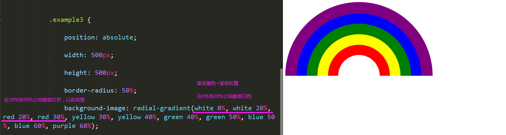
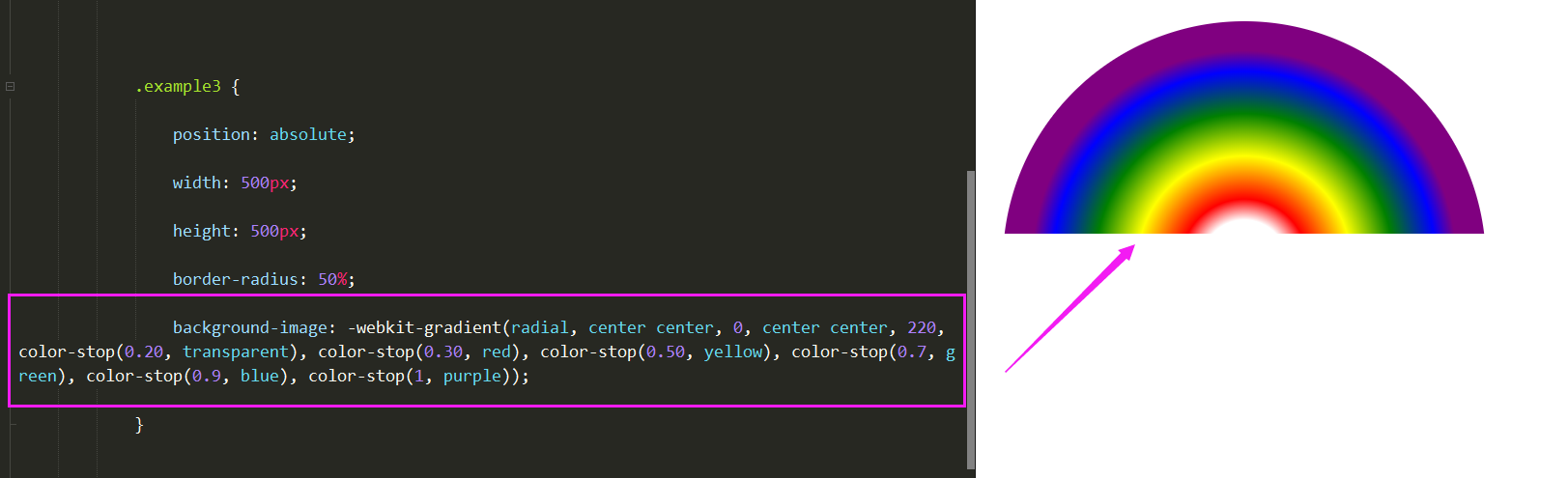
.example3 {
position: absolute;
width: 500px;
height: 500px;
border-radius: 50%;
background-image: -webkit-gradient(radial, center center, 0, center center, 220, color-stop(0.20, transparent), color-stop(0.40, red), color-stop(0.6, green), color-stop(0.8, blue), color-stop(1, purple));
}
</style>
</head>
<body>
<div class="box2">
<div class="example3">
</div>
</div>
</body>
</html>


恭喜解决一个难题,获得1积分~
来为老师/同学的回答评分吧
0 星