麻烦老师看下两块代码有没有错误和需要修改的地方 谢谢
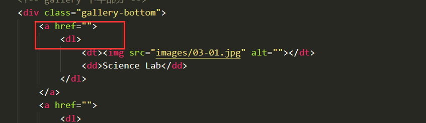
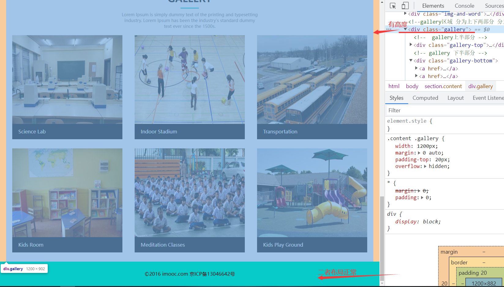
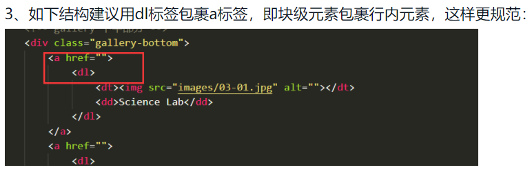
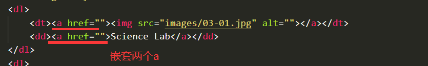
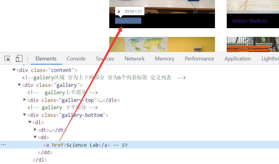
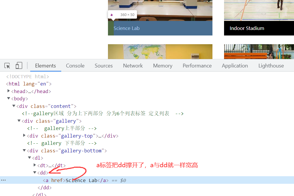
<!-- 网页的头部包含logo和导航条 --> <header> <div class="header-top"> <!-- 网页的logo --> <div class="logo"> <h1>Gareer Builder</h1> </div> <!-- 网页的导航条 --> <nav> <ul> <li><a href=""> HOME</a></li> <li><a href=""> ABOUT</a></li> <li><a href=""> GALLERY</a></li> <li><a href=""> FACULTY</a></li> <li><a href=""> EVENTS</a></li> <li><a href=""> CONTACT</a></li> </ul> </nav> </div> </header> <!-- banner区域 --> <section class="banner"> <!-- 图片 --> <img class="banner-img" src="images/banner3.jpg" alt=""> <!-- 遮罩层 --> <div class="hidden"></div> <div class="center"> <!-- 表单区域 --> <form action=""> <input type="text" placeholder="your Name"> <input type="text" placeholder="your Phone"> <input type="email" placeholder="your Email"> <textarea name="" id="" cols="50" rows="5" placeholder="Write your Comment Here"></textarea> <input type="submit" value="SEND MESSAGE"> </form> </div> </section> <!-- 内容区域 --> <section class="content"> <!-- about区域 分为上下部分--> <div class="about"> <!-- about上半部分 --> <div class="about-top"> <h2>About</h2> <div class="line"></div> <p>Lorem Ipsum is simply dummy text of the printing and typesetting industry. Lorem Ipsum has been the industry's standard dummy text ever since the 1500s.</p> </div> <!-- about下半部分 --> <div class="about-bottom"> <!-- 左边部分 --> <div class="left"> <h2>A WORD ABOUT US</h2> <!-- 左边内容区域 --> <div class="word"> <p>Praesent dignissim viverra est, sed bibendum ligula congue non. Sed ac nisl et felis gravida commodo? Suspendisse eget ullamcorper ipsum. Suspendisse diam amet.</p> <button><a href="">EXPLORE</a></button> </div> </div> <!-- 图片区域 --> <img class="pics" src="images/bb3.jpg" alt=""> <!-- 右边区域 学生和天赋--> <div class="students-and-faculty"> <!-- 学生区域 --> <div class="students"> <h3>70000</h3> <div class="line"></div> <h4>Students</h4> </div> <!-- 天赋区域 --> <div class="faculty"> <h3>600</h3> <div class="line"></div> <h4>Faculty</h4> </div> </div> </div> </div> <!-- 图文混排区域 ul来分为8个盒子--> <div class="img-and-word"> <ul> <li> <a class="img" href=""><img src="images/b1.jpg" alt=""></a> </li> <li> <div class="word"> <h3>Library</h3> <p class="p1">Lorem Ipsum is simply dummy text of the printing and typesetting industry</p> <p class="p2">Lorem Ipsum has been the industry's standard dummy text ever since the 1500s, when an unknown printer took a galley of type and scrambled it to make a type specimen book.</p> <button><a href="">EXPLORE</a></button> </div> </li> <li> <a class="img" href=""><img src="images/b2.jpg" alt=""></a> </li> <li> <div class="word"> <h3>Library</h3> <p class="p1">Lorem Ipsum is simply dummy text of the printing and typesetting industry</p> <p class="p2">Lorem Ipsum has been the industry's standard dummy text ever since the 1500s, when an unknown printer took a galley of type and scrambled it to make a type specimen book.</p> <button><a href="">EXPLORE</a></button> </div> </li> <li> <div class="word"> <h3>Library</h3> <p class="p1">Lorem Ipsum is simply dummy text of the printing and typesetting industry</p> <p class="p2">Lorem Ipsum has been the industry's standard dummy text ever since the 1500s, when an unknown printer took a galley of type and scrambled it to make a type specimen book.</p> <button><a href="">EXPLORE</a></button> </div> </li> <li> <a class="img" href=""><img src="images/b3.jpg" alt=""></a> </li> <li> <div class="word"> <h3>Library</h3> <p class="p1">Lorem Ipsum is simply dummy text of the printing and typesetting industry</p> <p class="p2">Lorem Ipsum has been the industry's standard dummy text ever since the 1500s, when an unknown printer took a galley of type and scrambled it to make a type specimen book.</p> <button><a href="">EXPLORE</a></button> </div> </li> <li> <a class="img" href=""><img src="images/b3.jpg" alt=""></a> </li> </ul> </div> <!--gallery区域 分为上下两部分 分为6个列表标签 定义列表 --> <div class="gallery"> <!-- gallery上半部分 --> <div class="gallery-top"> <h2>GALLERY</h2> <div class="line"></div> <p>Lorem Ipsum is simply dummy text of the printing and typesetting industry. Lorem Ipsum has been the industry's standard dummy text ever since the 1500s.</p> </div> <!-- gallery 下半部分 --> <div class="gallery-bottom"> <a href=""> <dl> <dt><img src="images/03-01.jpg" alt=""></dt> <dd>Science Lab</dd> </dl> </a> <a href=""> <dl> <dt><img src="images/03-02.jpg" alt=""></dt> <dd>Indoor Stadium</dd> </dl> </a> <a href=""> <dl> <dt><img src="images/03-03.jpg" alt=""></dt> <dd>Transportation</dd> </dl> </a> <a href=""> <dl> <dt><img src="images/03-04.jpg" alt=""></dt> <dd>Kids Room</dd> </dl> </a> <a href=""> <dl> <dt><img src="images/03-05.jpg" alt=""></dt> <dd>Meditation Classes</dd> </dl> </a> <a href=""> <dl> <dt><img src="images/03-06.jpg" alt=""></dt> <dd>Kids Play Ground</dd> </dl> </a> </div> </div> </section> <!-- 页脚区域 --> <footer> <p>©2016 imooc.com 京ICP备13046642号</p> </footer>
*{
margin: 0;
padding: 0;
}
/* 去掉ul和ol的小圆点 */
ul,ol{
list-style: none;
}
/* 去掉超级链接的下划线 */
a{
text-decoration: none;
}
/* 头部 */
header{
/* 不设置宽度 自动撑满 */
background-color: #07cbc9;
}
header .header-top{
width: 1200px;
height: 80px;
margin: 0 auto;
}
header .header-top .logo{
float: left;
/* 不设置宽度 自动撑满 */
text-align: center;
/* 直接设置文字垂直居中 */
line-height: 80px;
color: #fff;
}
/* 导航条 */
header .header-top nav{
float: right;
}
header .header-top nav ul li{
float: left;
height: 80px;
margin-right: 20px;
text-align: center;
line-height: 80px;
}
header .header-top nav ul li:last-child{
margin-right: 0;
}
header .header-top nav ul li a{
display: block;
color: #fff;
padding: 0 10px;
}
header .header-top nav ul li a:hover{
background-color: gold;
color: #000;
}
/* banner区域 */
section.banner{
/* 宽度100% */
width: 100%;
position: relative;
}
section.banner img.banner-img{
/* 宽度100% */
width: 100%;
height: 600px;
}
section.banner .hidden{
width: 100%;
height: 600px;
background-color: rgba(0, 0, 0, 0.5);
position: absolute;
top: 0;
left: 0;
}
section.banner .center{
width: 520px;
height: 360px;
position: absolute;
top: 50%;
margin-top: -180px;
left: 50%;
margin-left: -260px;
}
section.banner .center form{
width: 504px;
text-align: center;
margin: 0 auto;
}
section.banner .center form input{
width: 492px;
height: 38px;
border: 1px solid #808080;
/* 去除边框背景 */
background: none;
margin-bottom: 20px;
color: #808080;
/* 去除鼠标点击时的外围线 */
outline: none;
padding-left: 10px;
}
section.banner .center form textarea{
width: 494px;
height: 110px;
margin-bottom: 20px;
/* 去除背景 */
background: none;
/* 去除鼠标点击时外围线 */
outline: none;
color: #808080;
padding-left: 10px;
}
section.banner .center form input:nth-of-type(4){
width: 200px;
height: 40px;
margin: 0 auto;
}
/* 内容部分 about区域 */
.content{
padding-top:30px;
}
.content .about{
/* 设置宽度 高度让内容撑开 居中显示 */
width: 1200px;
margin: 0 auto;
}
.content .about .about-top{
text-align: center;
}
.content .about .about-top .line{
width: 60px;
height: 3px;
background-color:#07cbc9;
margin: 10px auto;
}
.content .about .about-top h2{
font-size: 32px;
}
.content .about .about-top p{
color: gray;
font-size: 14px;
width: 450px;
margin: 0 auto;
}
/* 下半部分 */
.content .about .about-bottom{
width: 1200px;
height: 434px;
/* 缝隙用padding挤 */
padding-top: 30px;
position: relative;
overflow: hidden;
}
.content .about .about-bottom .left{
float: left;
}
.content .about .about-bottom .left h2{
font-size: 32px;
width: 200px;
}
.content .about .about-bottom .left .word{
/* 宽高不设置 让内容撑开 */
/* 需要压盖在图片上面 设置绝对定位 */
background-color: rgba(255,255,255,.5);
border: 1px solid gray;
position: absolute;
left: 0;
top: 130px;
}
.content .about .about-bottom .left .word p{
width: 300px;
padding: 20px;
font-size: 18px;
}
.content .about .about-bottom .left .word button{
box-sizing: border-box;
width: 140px;
height: 40px;
/* 去掉边框 */
border:none;
margin: 20px 20px;
}
.content .about .about-bottom .left .word button a{
display: block;
width: 140px;
height: 40px;
background-color: #000;
color: #fff;
text-align: center;
line-height: 40px;
}
.content .about .about-bottom img.pics{
/* 左浮动 */
float: left;
width: 650px;
height: 435px;
margin-left: 70px;
}
.content .about .about-bottom .students-and-faculty{
/* 左浮动 */
float: left;
text-align: center;
margin-left: 18px;
}
.content .about .about-bottom .students,.faculty{
/* 不设置高度让内容撑开 */
width: 260px;
border: 1px solid #07cbc9;
}
.content .about .about-bottom .students h3,.faculty h3{
font-size: 28px;
font-weight: bold;
padding-top: 40px;
}
.content .about .about-bottom .students .line,.faculty .line{
width: 60px;
height: 3px;
background-color: #07cbc9;
margin: 10px auto;
}
.content .about .about-bottom .students h4,.faculty h4{
padding-bottom: 40px;
}
.content .about .about-bottom .students{
margin-bottom: 30px;
}
/* 图文混排区域 */
.content .img-and-word{
width: 100%;
height: 760px;
background-color: orange;
margin-top: 20px;
}
.content .img-and-word ul {
overflow: hidden;
}
.content .img-and-word ul li{
float: left;
width: 25%;
height: 380px;
}
.content .img-and-word ul li a.img{
/* 转块 */
display: block;
/* 宽度自适应 */
height: 380px;
}
.content .img-and-word ul li img{
/* 宽度自适应 */
height: 380px;
/* img是行内元素 转块消除间隙 */
display: block;
}
.content .img-and-word ul li .word{
height: 380px;
background-color: #07cbc9;
}
.content .img-and-word ul li .word h3{
padding:20px 20px 30px;
padding-right: 0;
font-size: 24px;
color: #fff;
}
.content .img-and-word ul li .word p{
padding-left: 20px;
}
.content .img-and-word ul li .word p.p1{
color: #fff;
font-size: 16px;
padding-bottom: 20px;
}
.content .img-and-word ul li .word p.p2{
color: gray;
font-size: 14px;
padding-bottom: 30px;
}
.content .img-and-word ul li .word button{
width: 138px;
height: 40px;
/* 转块 让其水平居中 */
display:block;
margin: 0 auto;
background-color: #000;
/* 去掉边框线 */
border: none;
}
.content .img-and-word ul li .word button a{
color: #fff;
/* 转块 让按钮点击范围更大 */
display: block;
width: 138px;
height: 40px;
text-align: center;
line-height: 40px;
}
.content .img-and-word ul li .word button a:hover{
background-color: #fff;
color: #000;
}
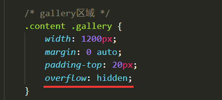
/* gallery区域 */
.content .gallery{
width: 1200px;
margin: 0 auto;
padding-top: 20px;
}
.content .gallery .gallery-top {
text-align: center;
}
.content .gallery .gallery-top h2{
font-size: 32px;
}
.content .gallery .gallery-top .line{
width: 60px;
height: 3px;
background-color: #07cbc9;
margin: 10px auto;
}
.content .gallery .gallery-top p{
color: gray;
font-size: 14px;
width: 450px;
margin: 0 auto;
}
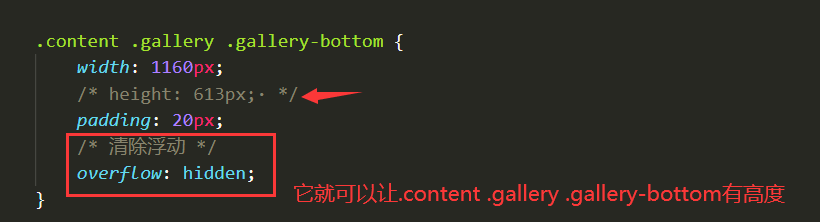
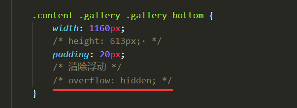
.content .gallery .gallery-bottom{
width: 1160px;
height: 613px;
padding: 20px;
/* 清除浮动 */
overflow: hidden;
}
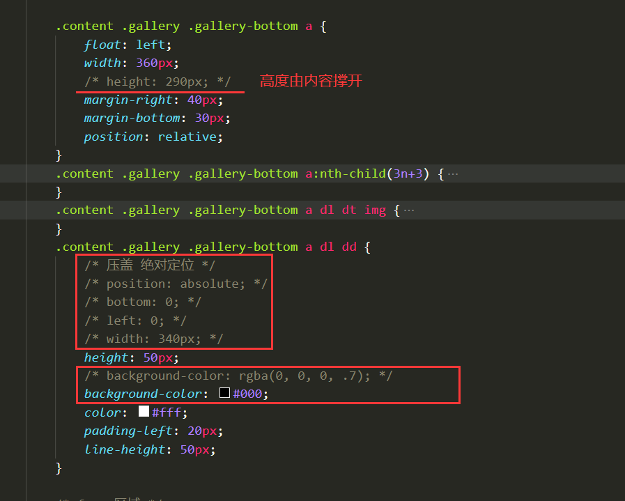
.content .gallery .gallery-bottom a{
float: left;
width: 360px;
height: 290px;
margin-right: 40px;
margin-bottom: 30px;
position: relative;
}
.content .gallery .gallery-bottom a:nth-child(3n+3){
margin-right: 0;
}
.content .gallery .gallery-bottom a dl dt img{
display: block;
width: 360px;
height: 290px;
}
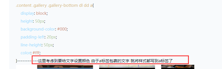
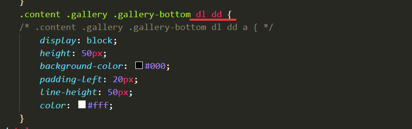
.content .gallery .gallery-bottom a dl dd{
/* 压盖 绝对定位 */
position: absolute;
bottom: 0;
left:0;
width: 340px;
height: 50px;
background-color: rgba(0,0,0,.7);
color: #fff;
padding-left: 20px;
line-height: 50px;
}
/* fooer区域 */
footer{
width: 100%;
height: 80px;
background-color: #07cbc9;
text-align: center;
line-height: 80px;
}.content .gallery .gallery-bottom{
width: 1160px;
height: 613px;
padding: 20px;
/* 清除浮动 */
overflow: hidden;
}
.content .gallery .gallery-bottom a{
float: left;
width: 360px;
height: 290px;
margin-right: 40px;
margin-bottom: 30px;
position: relative;
}
这里的设置了浮动 后面页脚部分追上来了 清除浮动是应该写在gallery还是gallery-bottom处
9
收起
正在回答 回答被采纳积分+1
1回答
相似问题
老师麻烦帮我看看代码还有没有需要修改的地方
0
0
5


老师麻烦看一下 调试不出来 代码如下
6
0
2

老师,您好,麻烦您看一下我的代码,哪里有问题?
0
2
11


代码如下,请老师检阅一下,是否有需要修改的地方
66
2
6


登录后可查看更多问答,登录/注册


恭喜解决一个难题,获得1积分~
来为老师/同学的回答评分吧
0 星