老师您好,请检查作业,谢谢
4-8 自由编程
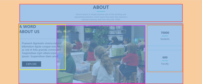
about区域布局效果的实现需要使用浮动和定位,前面我们已经学习过了这两个知识点,接下来让我们参考效果标注图,完成这部分的布局吧~
CSS相关代码:
*{
margin: 0;
padding: 0;
}
.about{
width: 1200px;
margin: 0 auto;
margin-top: 30px;
}
.about h2{
font-size: 32px;
text-align: center;
}
.about .about-underline{
width: 60px;
height: 3px;
background-color: #07cbc9;
margin: 10px auto;
}
.about .about-intro{
width: 440px;
height: 60px;
font-size: 14px;
color: grey;
text-align: center;
margin: 0 auto;
}
.about .about-content{
position: relative;
width: 1200px;
height: 464px;

}
.about .about-content h3{
float: left;
font-size: 28px;
margin-top: 20px;
}
.about .about-content .about-article{
position: absolute;
float: left;
top: 50%;
margin-top: -103px;
width: 300px;
padding: 20px;
font-size: 18px;
border: 1px solid grey;
background: rgba(255, 255, 255, 0.5);
}
.about .about-content .about-article .btn-explore{
width: 140px;
height: 40px;
background-color: black;
color: white;
text-align: center;
line-height: 40px;
margin-top: 25px;
}
.about .about-content img{
float: left;
margin-top: 30px;
margin-left: 125px;
}
.about .about-content .student-num{
float: right;
width: 260px;
padding-top: 40px;
padding-bottom: 40px;
margin-top: 30px;
margin-bottom: 30px;
text-align: center;
border: 1px solid #07cbc9;
}
.about .about-content .student-num .r1{
font-size: 20px;
font-weight: bold;
}
.about .about-content .student-num .underline{
width: 45px;
height: 3px;
background-color: #07cbc9;
margin: 10px auto;
}
.about .about-content .faculty-num{
float: right;
width: 260px;
padding-top: 40px;
padding-bottom: 40px;
text-align: center;
border: 1px solid #07cbc9;
}
.about .about-content .faculty-num .r1{
font-size: 20px;
font-weight: bold;
}
.about .about-content .faculty-num .underline{
width: 45px;
height: 3px;
background-color: #07cbc9;
margin: 10px auto;
}
HTML相关代码:
<!DOCTYPE html>
<html lang="en">
<head>
<meta charset="UTF-8">
<meta http-equiv="X-UA-Compatible" content="IE=edge">
<meta name="viewport" content="width=device-width, initial-scale=1.0">
<title>Document</title>
<link rel="stylesheet" href="css/css.css">
</head>
<body>
<div class="about">
<h2>ABOUT</h2>
<div class="about-underline"></div>
<div class="about-intro">Dorem Ipsum is simply dummy text of the printing and typesetting industry. Lorem Ipsum has been the industry's standard dummy text ever since the 1500s
</div>
<div class="about-content">
<h3>A WORD<br/>
ABOUT US
</h3>
<div class="about-article">
<p>
Praesent dignissim viverra est,sed bibendum ligula congue non.
Sed ac nisl et felis gravida commodo? Suspendisse eget ullamcorper ipsum.
Suspendisse diam amet
</p>
<div class="btn-explore">EXPLORE</div>
</div>
<img src="images/bb3.jpg">
<div class="student-num">
<div class="r1">70000</div>
<div class="underline"></div>
<p>Students</p>
</div>
<div class="faculty-num">
<div class="r1">600</div>
<div class="underline"></div>
<p>Faculty</p>
</div>
</div>
</div>
</body>
</html>
相关图片:
11
收起
正在回答
1回答
同学你好,代码可以实现需求。如下建议仅供参考:从设计图上来看我们可以将结构分为如下
祝学习愉快!
相似问题


登录后可查看更多问答,登录/注册


恭喜解决一个难题,获得1积分~
来为老师/同学的回答评分吧
0 星