请问已经画好了一个云朵,怎么出现五个云朵
<!DOCTYPE html>
<html>
<head>
<title>index</title>
<link rel="stylesheet" type="text/css" href="index.css">
</head>
<body>
<div class="bg">
<!-- 蓝天 -->
<div class="sky">
<div class="cloud one"></div>
<div class="cloud two"></div>
<div class="cloud three"></div>
<div class="cloud four"></div>
<div class="cloud five"></div>
</div>
<!-- 草地 -->
<div class="ground"></div>
</div>
</body>
</html>
---------------------------------------------------------------
/*背景*/
.bg{
height: 655px;
width: 100%;
position: relative;
}
.sky{
height: 60%;
width: 100%;
background:-webkit-linear-gradient(rgb(196, 228, 253),#fff);
background: -moz-linear-gradient(rgb(196, 228, 253),#fff);
background: -o-linear-gradient(rgb(196, 228, 253),#fff);
background: linear-gradient(rgb(196, 228, 253),#fff);
}
.ground{
height: 40%;
width: 100%;
background:-webkit-linear-gradient(#fff,rgb(148, 190, 89));
background: -moz-linear-gradient(#fff,rgb(148, 190, 89));
background: -o-linear-gradient(#fff,rgb(148, 190, 89));
background: linear-gradient(#fff,rgb(148, 190, 89));
}
/*白云*/
.cloud{
position: absolute;
background:#fff;
width: 100px;
height: 100px;
border-radius: 50%;
top: 100px;
left: 50%;
transform: translate(-50%,0);
}
.cloud:before{
background:#fff;
content:" ";
display: block;
width: 175px;
height: 50px;
position: absolute;
left: 20px;
transform: translate(-50%,0);
top: 40px;
border-radius: 25px;
}
.cloud:after{
background:#fff;
content:" ";
display: block;
width: 80px;
height: 60px;
position: absolute;
left: -10px;
transform: translate(-50%,0) rotate(65deg);
top: 33px;
border-radius: 40px 30px;
}
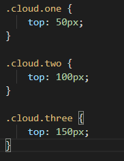
.cloud.one{
top: 400px;
}


恭喜解决一个难题,获得1积分~
来为老师/同学的回答评分吧
0 星