老师 我照着视频里的一步一步的敲 效果不对 检查不出来
<!DOCTYPE html>
<html lang="en">
<head>
    <meta charset="UTF-8">
    <meta http-equiv="X-UA-Compatible" content="IE=edge">
    <meta name="viewport" content="width=device-width, initial-scale=1.0">
    <title>Carioon Dog</title>
   <link rel="stylesheet" href="轮廓和耳朵.css">
</head>
<body>
    <div class="dog center">
        <div class="forehead center"></div>
        <div class="face center"></div>
        <div class="chin center"></div>
        <div class="ear"></div>
        <div class="ear right"></div>
        <div class="birthmark"></div>
        <div class="eye">
            <div class="pupil"></div>
        </div>
        <div class="eye right">
            <div class="pupil"></div>

        </div>
        <div class="nose center">
            <div class="nostril"></div>
            <div class="nostril right"></div>
        </div>

        <div class="mouth center">
            <div class="teen"></div>
            <div class="teen right"></div>
            <div class="tongue center"></div>

        </div>

        <div class="body center">
            <div class="arm"></div>
            <div class="arm right"></div>
            <div class="leg">
                <div class="foot"></div>
            </div>
            <div class="leg right">
                <div class="foot"></div>
            </div>
            <div class="belly"></div>
        </div>

    </div>
</body>
</html>
:root
{
--h1: #1b2f90; --bg: #f9f9f6;
}
body
{
background: #ffc400;
}
.dog
{
position: relative; width: 300px;height: 400px;
}
.center
{
position: absolute;left: 50%;
transform: translate(-50%,0);
/* 居中 */
}
.forehead
{
position: absolute;
z-index: 1;
left: 50%;
width: 102px;height: 48px;
transform: translate(-50%,0);
border-radius: 51px / 40px 40px 8px 8px;
background: var(--bg);
}
.face
{
z-index: 1; top: 20px;
width: 110px;height: 68px;
border-radius: 50%; background: var(--bg);
}
.chin
{
z-index: 1; top: 60px;
width: 104px;height: 36px;
border-radius: 52px / 0 0 36px 36px; background: var(--bg);
}
.ear
{
position: absolute; z-index: 0; top: 20px; left: 50%; width: 16px;height: 70px ;
transform: translate(-42px,0) rotate(10deg);
transform-origin: 50% 0;
border-radius: 50%;
background: var(--h1);
}
.ear.right
{
transform: scale(-1,1) translate(-26px,0) rotate(10deg) ;
}
.eye{ position: absolute; z-index: 0;
z-index: 2;
top: 20px; left: 50%; width: 24px;height: 24px ;
transform: translate(-44px,0) rotate(10deg);
transform-origin: 50% 0;
border-radius: 12px / 13px 12px 12px 2px;
background: var(--bg);
box-shadow: 1px 0px 0px 0px #000 inset;
}
.eye.right{
transform: scale(-1,1)translate(-21px,0)rotate(10deg);
box-shadow: 1px 0px 0px 0px #000 inset;
}
.birthmark{
position: absolute;
z-index: 1;
top: 10px;
left: 50%;
width: 30px;height: 36px;
transform: translate(15px,0)rotate(-10deg);
border-radius: 15px / 17px 23px 2px 13px;
background: var(--h1);
}
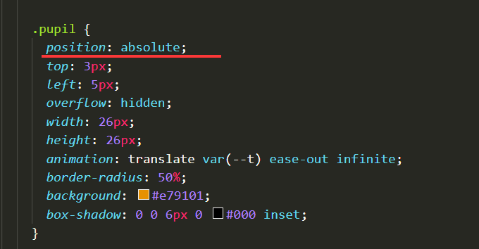
.pupil{
top: 1px;left: 3px;
overflow: hidden;
width: 26px;height: 26px;
border-radius: 50%;
background: #e79101;
box-shadow: 0 0 8px 0 #000 inset;
}
/* 眼球 */
.pupil:before{
position: absolute;
top: 50%;
left: 50%;
width: 18px;
height: 18px;
margin: -9px 0 0 -9px;
content: '';
border-radius: 50%;
background: #000;
}
.pupil:after{
position: absolute;
top: 6px;
left: 17px;
width: 5px;
height: 5px;
content: '';
border-radius: 50%;
background: #fff;
}
.nose{
z-index: 1;
top: 41px;
width:62px ;height: 32px;
border-radius: 31px/ 10px 10px 22px 22px;
background: #363035;
}
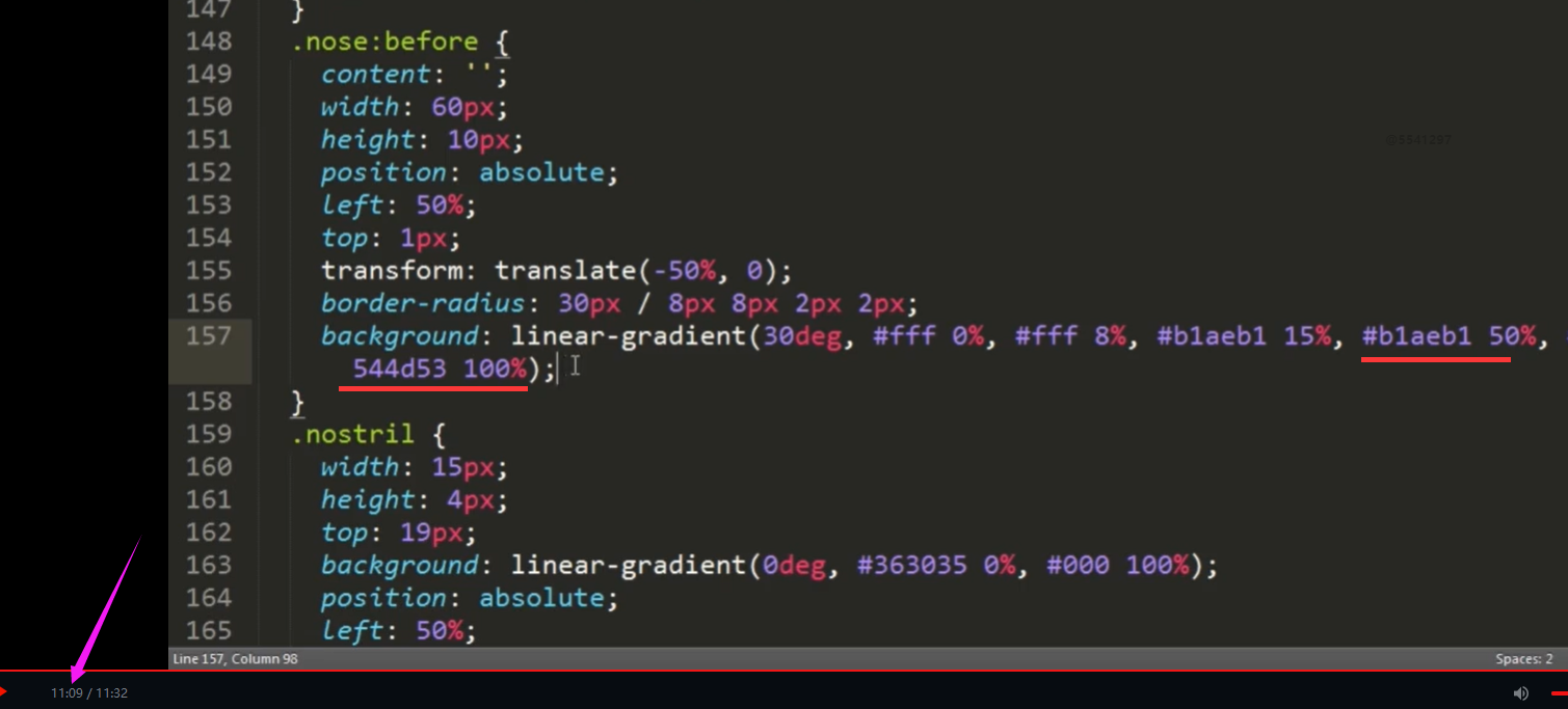
.nose:before{
position: absolute;
top: 1px;
left: 50%;
display: block;
width: 60px;
height: 15px;
content: '';
transform: translate(-50%,0);
border-radius: 30px /8px 8px 2px 2px;
background:linear-gradient(30deg,#fff 0%,#fff 8%,#b1aeb1 15%,#b1aeb1 50%,
#544d53 100%);
}
.nostril{
position: absolute;
top: 19px;
left: 50%;
width:15px ;height: 4px;
transform: translate(-21px,0)rotate(30deg);
border-radius: 30px/ 10px 10px 22px 22px;
background: linear-gradient(0deg,#000 0%,#363035 100%);
}
.nostril.right{
transform: translate(-7px,0)rotate(30deg)scale(-1,1);
}
.mouth{
z-index: 1;
top: 68px;
width: 68px;
height: 27px;
border-radius: 34px / 0px 0px 27px 27px;
background:#671316;
box-shadow: 0 0 4px 0 #000 inset;
}
.mouth:before{
position: absolute;
z-index: 1;
top: 0;
left: 0;
width: 68px;
height: 8px;
content: '';
border-radius: 34px/0px 0px 5px 5px;
background: var(--bg);
}
.teen{
position: absolute;
top: 7px;
left: 50%;
width:8px ;
height: 3px;
transform: translate(-8px,0);
border: radius 4px / 0px 0px 3px 3px ;
background:var(--bg) ;
}
.teen.right{
transform:scale(-1,1)translate(-8px,0);
border-right: .5px solid #ddd;
}
.tongue{
z-index: 1;
top: 0px;
width: 34px;
height: 14px;
border-radius: 17px/ 0px 0px 7px 7px;
background: #a2504f;
box-shadow: 0 0 4px 0 #000 inset;
}
/* 牙齿部分 */
.body{
top: 89px;
width: 66px;
height: 70px;
border-radius: 50%;
background: var(--bg);
}
.arm{
position: absolute;
top: 5px;
left: 50%;
width: 26px;
height: 40px;
transform: translate(-43px,0) rotate(21deg);
border-radius: 13px /20px 0 14px 20px;
background: var(--bg);
}
.arm:before{
position: absolute;
top: 14px;
right: 6px;
width: 5px;
height: 20px;
content: '';
transform: rotate(-5deg);
border-radius: 5px/10px 0px 0px 10px;
box-shadow: -1px 0 0px 0 rgba(200 200 200,0.5);
}
.arm.right{
transform: scale(-1,1) translate(-17px,0)rotate(21deg);
}
.leg{
position: absolute;
top: 40px;
left: 50%;
width: 29px;
height: 50px;
transform: translate(-32px,0);
border: radius 15px / 5px 5px 15px 45px;
background: linear-gradient(-85deg,#ddd 0%,#ddd 5%,#fff 16%,#fff 100%);
}
.leg.right{
transform: scale(-1,1)translate(-3px,0);
}
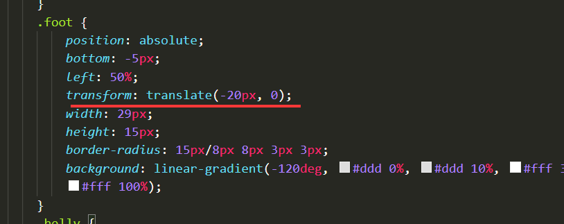
.foot{
position: absolute;
bottom: -8px;
left: 2px;
width: 29px;
height: 15px;
border-radius: 15px/10px 10px 5px 5px;
background: linear-gradient(-120deg,#ddd 0%,#ddd 10%,#fff 30%,#fff 100%);
}
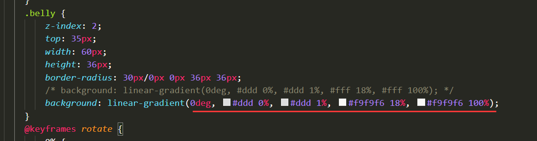
.belly{
z-index: 2;
top: 34px;
width: 60px;
height: 36px;
border-radius: 30px/0px 0px 36px 36px;
background: linear-gradient(0deg,#ddd 0%, #ddd 10%,#fff 30%,#fff 100%);
}14
收起
正在回答 回答被采纳积分+1
2回答


好帮手慕久久
2021-11-18 09:58:03
同学你好,效果与视频中的不一样,有如下原因:
1、某些尺寸设置的有差异,比如:
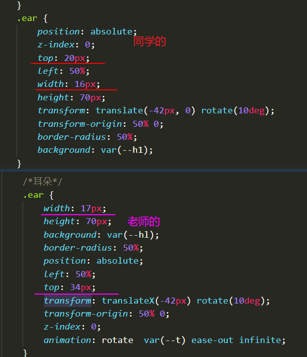
微小的差异攒在一起就会造成整体差异较大。这样的差异挺多的,同学自己查找一下。
2、nostril相关的旋转、位移设置的与老师不符,其他结构也存在类似问题:
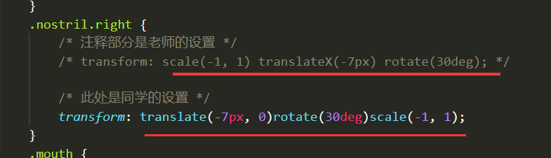
transform连写时,先设置平移再设置旋转与先旋转再平移的效果是不一样的,即平移、旋转、缩放的先后顺序会影响最终的效果,如果同学按照自己的顺序写,那么各个数值需要做调整,不能照搬老师的数值。
由于此处只是想让大家练习一下平移、旋转、缩放、背景等样式,所以建议同学按照视频中的尺寸、代码来写。实际开发中,不会让我们写这么复杂的效果,所以同学简单练习一下此处的效果就行。
祝学习愉快!

相似问题


登录后可查看更多问答,登录/注册


恭喜解决一个难题,获得1积分~
来为老师/同学的回答评分吧
0 星