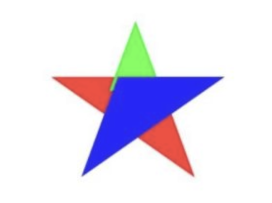
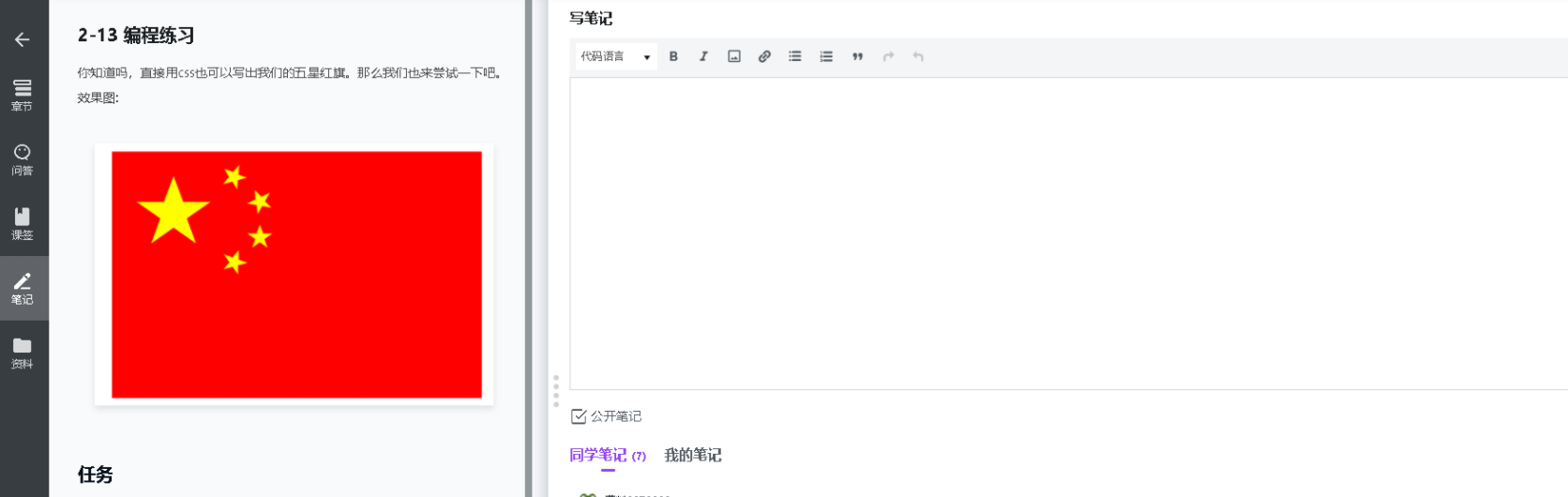
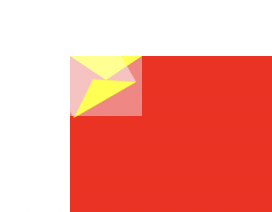
【2-13 五角星】注意记住transform等属性,border用一个角做五角星就行了。
================ 方法一 最优解法 ====================
相关代码:
<!DOCTYPE html>
<html>
<head>
<meta charset="UTF-8">
<meta name="viewport" content="width=device-width, initial-scale=1.0">
<title>Document</title>
<style>
*{
margin: 0;
padding:0;
}
.box{
width: 300px;
height: 200px;
background-color: red;
margin: 0 auto;
}
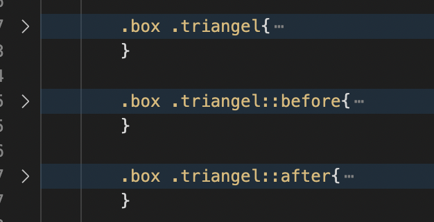
.box .triangel{
width: 0;
height: 0;
border: 18px solid transparent;
border-top:12px solid rgb(255, 255, 0);
position: relative;
transform: rotate(0deg);
}
.box .triangel::before{
content: "";
position: absolute;
width: 0;
height: 0;
top:-21px;
left:-23px ;
border: 18px solid transparent;
border-right:12px solid rgb(255, 255, 0);
transform: rotate(-20deg);
}
.box .triangel::after{
content: "";
position: absolute;
width: 0;
height: 0;
top:-21px;
left: -7px;
border: 18px solid transparent;
border-left:12px solid rgb(255, 255, 0);
transform: rotate(20deg);
}
.box .triangel:nth-child(1){
transform: scale(1.2) translateX(20px) translateY(30px);
}
.box .triangel:nth-child(2){
transform: scale(0.5) rotate(15deg) translateX(118px) translateY(-80px);
}
.box .triangel:nth-child(3){
transform: scale(0.5) rotate(15deg) translateX(131px) translateY(-32px);
}
.box .triangel:nth-child(4){
transform: scale(0.5) rotate(38deg) translateX(51px) translateY(-215px);
}
.box .triangel:nth-child(5){
transform: scale(0.5) translateX(177px) translateY(-148px)
}
</style>
</head>
<body>
<div class="box">
<div class="triangel "></div>
<div class="triangel "></div>
<div class="triangel "></div>
<div class="triangel "></div>
<div class="triangel "></div>
</div>
</body>
</html>问题描述:
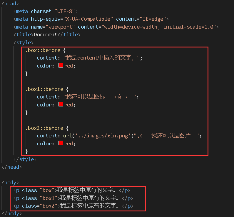
Q1: 老师麻烦问下这里的content是什么意思?
相关截图:
================ 方法二 ====================
方法2:没有看提示直接做的。
五角星在iconfont上面找的svg,旋转用的rotate,距离用的padding
svg相关知识:
改大小在width,height中改;颜色用fill,不知道为什么暂时先记住
https://www.it1352.com/1859692.html
相关代码:
<!DOCTYPE html>
<html lang="en">
<head>
<meta charset="UTF-8">
<meta http-equiv="X-UA-Compatible" content="IE=edge">
<meta name="viewport" content="width=device-width, initial-scale=1.0">
<title>Document</title>
<style>
.star{
width: 900px;
height: 600px;
background: red;
position:relative;
}
.star div .icon{
fill:yellow;           /* svg更改颜色,用的fill。不知道什么原理,先记住吧。 */
}
.star div:nth-child(1){      /*  这里不是.star:nth-child(1),类比p:nth-child()  */
position:absolute;
top:80px;
left: 50px;
}
.star div:nth-child(2){
position:absolute;
top: 10px;
left: 180px;
transform:rotate(-72deg);
}
.star div:nth-child(3){
position:absolute;
top: 70px;
left: 220px;
transform:rotate(-36deg);
}
.star div:nth-child(4){
position:absolute;
top: 150px;
left: 220px;
transform:rotate(0deg);
}
.star div:nth-child(5){
position:absolute;
top: 220px;
left: 180px;
transform:rotate(36deg);
}
</style>
</head>
<body>
<div class="star">
<div><svg t="1637583341029" class="icon" viewBox="0 0 1024 1024" version="1.1" xmlns="http://www.w3.org/2000/svg" p-id="2534" width="120" height="120"><path d="M231.866858 924.559197l99.623975-315.315432L76.893274 391.534348l320.43094 0L512.050142 98.1586l128.641869 293.375747 306.414715 0L706.971553 609.097432 809.674657 925.850609 513.64343 727.408001 231.866858 924.559197z" p-id="2535"></path></svg></div>
<div><svg t="1637583341029" class="icon" viewBox="0 0 1024 1024" version="1.1" xmlns="http://www.w3.org/2000/svg" p-id="2534" width="60" height="60"><path d="M231.866858 924.559197l99.623975-315.315432L76.893274 391.534348l320.43094 0L512.050142 98.1586l128.641869 293.375747 306.414715 0L706.971553 609.097432 809.674657 925.850609 513.64343 727.408001 231.866858 924.559197z" p-id="2535"></path></svg></div>
<div><svg t="1637583341029" class="icon" viewBox="0 0 1024 1024" version="1.1" xmlns="http://www.w3.org/2000/svg" p-id="2534" width="60" height="60"><path d="M231.866858 924.559197l99.623975-315.315432L76.893274 391.534348l320.43094 0L512.050142 98.1586l128.641869 293.375747 306.414715 0L706.971553 609.097432 809.674657 925.850609 513.64343 727.408001 231.866858 924.559197z" p-id="2535"></path></svg></div>
<div><svg t="1637583341029" class="icon" viewBox="0 0 1024 1024" version="1.1" xmlns="http://www.w3.org/2000/svg" p-id="2534" width="60" height="60"><path d="M231.866858 924.559197l99.623975-315.315432L76.893274 391.534348l320.43094 0L512.050142 98.1586l128.641869 293.375747 306.414715 0L706.971553 609.097432 809.674657 925.850609 513.64343 727.408001 231.866858 924.559197z" p-id="2535"></path></svg></div>
<div><svg t="1637583341029" class="icon" viewBox="0 0 1024 1024" version="1.1" xmlns="http://www.w3.org/2000/svg" p-id="2534" width="60" height="60"><path d="M231.866858 924.559197l99.623975-315.315432L76.893274 391.534348l320.43094 0L512.050142 98.1586l128.641869 293.375747 306.414715 0L706.971553 609.097432 809.674657 925.850609 513.64343 727.408001 231.866858 924.559197z" p-id="2535"></path></svg></div>
</div>
</body>
</html>
其他思考:
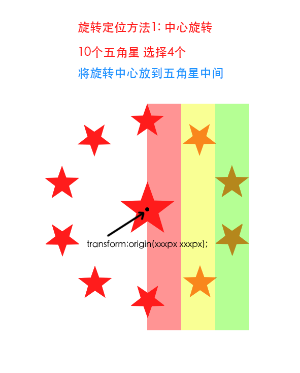
1)
2)不一定能形成五角星
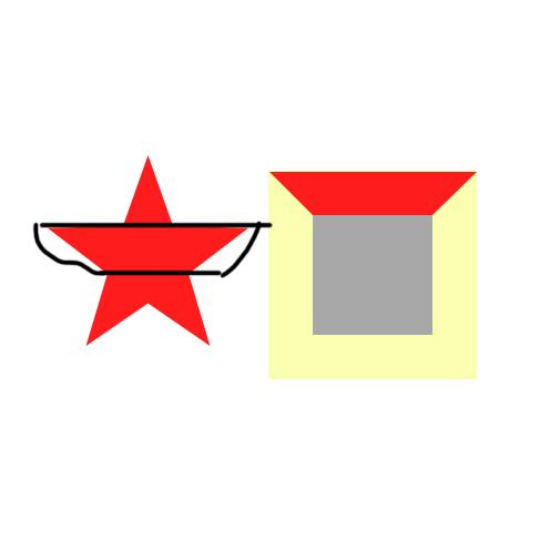
中心旋转对称
https://blog.csdn.net/u010234868/article/details/115434647
相关截图:
【总结】:
1. 复习下::before ::after content:""的知识点
2. 五角星用一个角就行,不一定要用两个角
3. 只做记录,不用回复
正在回答
同学你好,解答如下:
Q1: 老师麻烦问下这里的content是什么意思?
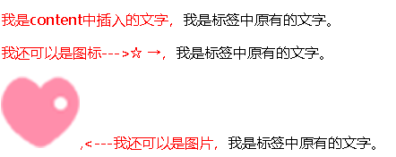
答:content是把生成的内容插入到标签中,那么content能插入什么呢?看下图:
同学如果想了解的更深入,以下链接中有关于伪类中的content属性介绍。
https://developer.mozilla.org/zh-CN/docs/Learn/CSS/Building_blocks/Selectors/Pseudo-classes_and_pseudo-elements
方法二中的svg中fill这个属性是给svg(矢量图)进行填充。
同学学习劲头很足,这样很棒。
如果同学要做笔记的话可以用以下方法哦~
祝学习愉快~

相似问题


登录后可查看更多问答,登录/注册


恭喜解决一个难题,获得1积分~
来为老师/同学的回答评分吧
0 星