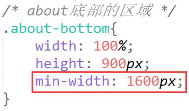
about区域中8张图片应该如何排版?如何居中?
问题:
- header区域右侧li悬浮时,如何控制宽度,我看案例演示的时候宽度挺正常的。
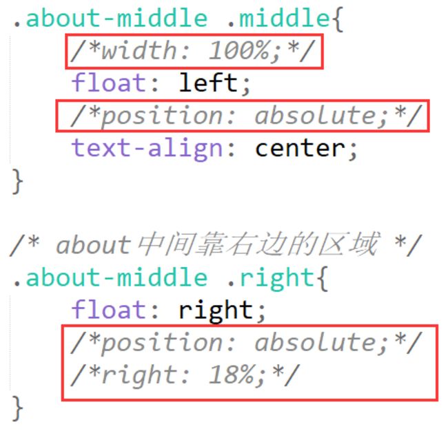
- ABOUT中间区域应该如何设置?每次我调整百分比的时候左右两侧的文字就挤到一起了。如果才能将两侧的文字相对中间的图片固定?
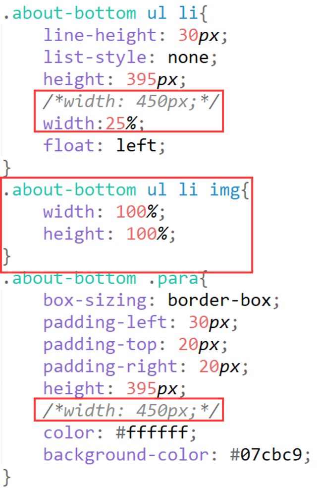
- ABOUT下部的8张图应该如何设置才能居中显示?
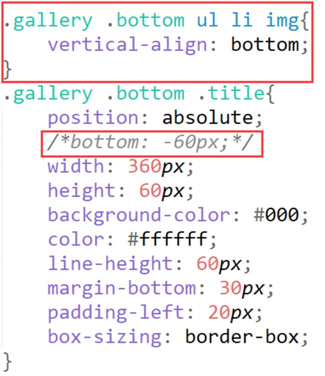
- GALLERY下面六张图应该如何设置才能居中显示?
- GALLERY下面六张图中,图片和文字应该是什么关系?我把ul li设置为父级元素,里面的title设置为子元素,父元素设置为relative,父元素设置为absolute,为什么设置bottom属性的时候还有一些富余的空白?
html
<!DOCTYPE html>
<html lang="en">
<head>
<meta charset="UTF-8">
<meta http-equiv="X-UA-Compatible" content="IE=edge">
<meta name="viewport" content="width=device-width, initial-scale=1.0">
<link type="text/css" rel="stylesheet" href="css/index.css">
<script type="text/javascript" src="index.js"></script>
<title>Document</title>
</head>
<body>
<!-- 头部区域 -->
<div class="header">
<div class="header_img">
<img src="images/logo.png" alt="#">
</div>
<div class="menu">
<ul>
<li><a href="#">HOME</a></li>
<li><a href="#">ABOUT</a></li>
<li><a href="#">GALLERY</a></li>
<li><a href="#">FACULTY</a></li>
<li><a href="#">EVENTS</a></li>
<li><a href="#">CONTACT</a></li>
</ul>
</div>
</div>
<!-- //头部区域 -->
<!-- banner区域 -->
<div class="banner">
<img src="images/banner3.jpg" alt="#">
<div class="layer"></div>
<div class="form">
<form action="">
<input type="text" placeholder="your Name" /><br>
<input type="text" placeholder="your Phone" /><br>
<input type="text" placeholder="your Email" /><br>
<textarea name="" id="" cols="30" rows="3" placeholder="Write Your Comment Here"></textarea><br>
<input type="button" class="btn" value="SEND MESSAGES">
</form>
</div>
</div>
<!-- //banner区域 -->
<!-- about top区域 -->
<div class="about-top">
<div class="about">ABOUT</div>
<div class="underline"></div>
<div class="para">
<p>Lorem Ipsum is simply dummy text of the printing and typesetting industy. Lorem Ipsum has been the industry's
standard dummy text ever since the 1500s</p>
</div>
</div>
<!-- //about top区域 -->
<!-- about middle区域 -->
<div class="about-middle">
<div class="left">
<div class="word">A WORD ABOUT US</div>
<div class="box">
<p>Praesent dignissim viverra est, sed bibendum ligula congue non. Sed ac nisl et felis gravida commodo? Suspendisse
eget ullamcorper ipsum. Suspendisse diam amet.</p>
<input type="button" value="EXPLORE">
</div>
</div>
<div class="middle">
<img src="images/bb3.jpg" alt="#"/>
</div>
<div class="right">
<ul>
<li>
<div class="board">
<div class="num">70000</div>
<div class="underline"></div>
Students
</div>
</li>
<li>
<div class="board">
<div class="num">600</div>
<div class="underline"></div>
Faculty
</div>
</li>
</ul>
</div>
</div>
<!-- //about middle区域 -->
<!-- about bottom区域 -->
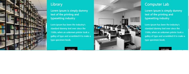
<div class="about-bottom">
<ul>
<li>
<img src="images/b1.jpg" alt="#">
</li>
<li>
<div class="para">
<div class="title">Library</div>
<div class="abstract">Lorem Ipsum is simply dummy text of the printing and typesetting industry</div>
<div class="content">Lorm Ipsum has been the industry's standard dummy text ever since the 1500s,
when an unkonwn printer took a galley of type and scrambled it to make a type specimen book.</div>
<div class="btn"><input type="button" value="EXPLORE"></div>
</div>
</li>
<li>
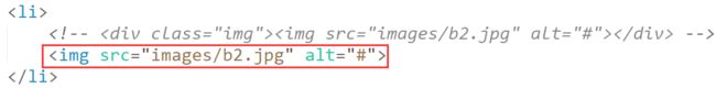
<div class="img"><img src="images/b2.jpg" alt="#"></div>
</li>
<li>
<div class="para">
<div class="title">Computer Lab</div>
<div class="abstract">Lorem Ipsum is simply dummy text of the printing and typesetting industry</div>
<div class="content">Lorm Ipsum has been the industry's standard dummy text ever since the 1500s,
when an unkonwn printer took a galley of type and scrambled it to make a type specimen book.</div>
<div class="btn"><input type="button" value="EXPLORE"></div>
</div>
</li>
<li>
<div class="para">
<div class="title">Conference Hall</div>
<div class="abstract">Lorem Ipsum is simply dummy text of the printing and typesetting industry</div>
<div class="content">Lorm Ipsum has been the industry's standard dummy text ever since the 1500s,
when an unkonwn printer took a galley of type and scrambled it to make a type specimen book.</div>
<div class="btn"><input type="button" value="EXPLORE"></div>
</div>
</li>
<li>
<img src="images/b3.jpg" alt="#">
</li>
<li>
<div class="para">
<div class="title">Play Ground</div>
<div class="abstract">Lorem Ipsum is simply dummy text of the printing and typesetting industry</div>
<div class="content">Lorm Ipsum has been the industry's standard dummy text ever since the 1500s,
when an unkonwn printer took a galley of type and scrambled it to make a type specimen book.</div>
<div class="btn"><input type="button" value="EXPLORE"></div>
</div>
</li>
<li>
<img src="images/b4.jpg" alt="#">
</li>
</ul>
</div>
<!-- //about bottom区域 -->
<!-- gallery区域 -->
<div class="gallery">
<div class="top">
<div class="about">GALLERY</div>
<div class="underline"></div>
<div class="para">
<p>Lorem Ipsum is simply dummy text of the printing and typesetting industy. Lorem Ipsum has been the industry's
standard dummy text ever since the 1500s.</p>
</div>
</div>
<div class="bottom">
<ul>
<li>
<img src="images/03-01.jpg" alt="">
<div class="title">SCIENCE LAB</div>
</li>
<li>
<img src="images/03-02.jpg" alt="">
<div class="title">INDOOR STADIUM</div>
</li>
<li>
<img src="images/03-03.jpg" alt="">
<div class="title">TRANSPORTATION</div>
</li>
<li>
<img src="images/03-04.jpg" alt="">
<div class="title">KIDS ROOM</div>
</li>
<li>
<img src="images/03-05.jpg" alt="">
<div class="title">MEDITATION CLASSES</div>
</li>
<li>
<img src="images/03-06.jpg" alt="">
<div class="title">KIDS PLAY GROUND</div>
</li>
</ul>
</div>
</div>
<!-- //gallery区域 -->
<!-- foot区域 -->
<div class="foot">
2016 imooc.com 京ICP备13046642号
</div>
<!-- //foot区域 -->
</body>
</html>
css
*{
padding: 0px;
margin: 0px;
}
body{
font-family:'Microsoft Yahei UI';
}
.header{
width: 100%;
height: 80px;
position: fixed;
top: 0;
z-index: 30;
background-color: #07cbc9;
}
.header .header_img{
float: left;
margin-left: 100px;
margin-top: 15px;
}
.header .menu{
float: right;
height: 80px;
margin-right: 100px;
line-height: 80px;
font-weight: 700;
}
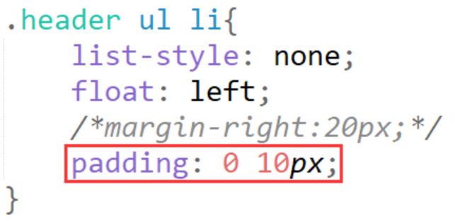
.header ul li{
list-style: none;
float: left;
margin-right:20px;
}
.header .menu ul li:hover{
background-color: #000;
}
a{
text-decoration: none;
color: #ffffff;
}
.banner{
width: 100%;
margin-top: 80px;
height: 800px;
position: relative;
}
.banner img{
height: 800px;
width: 100%;
position: absolute;
}
.banner .layer{
height: 800px;
width: 100%;
position: absolute;
background-color: #000;
opacity: 0.4;
z-index: 10;
}
.banner .form{
width: 100%;
height: 500px;
top: 0;
position: absolute;
text-align: center;
margin-top: 100px;
z-index: 20;
}
.banner input, textarea{
box-sizing: border-box;
padding-left: 10px;
width: 400px;
margin-top: 30px;
line-height: 40px;
border: 2px solid #ffffff;
color: #ffffff;
font-family:'Microsoft Yahei UI';
background-color: transparent;
}
input::-webkit-input-placeholder, textarea::-webkit-input-placeholder {
color: #ffffff;
}
.banner input{
height: 40px;
}
.banner .btn{
width: 150px;
}
.banner input:hover{
border: 2px solid #07cbc9;
}
.banner textarea:hover{
border: 2px solid #07cbc9;
}
/* about的区域 */
.about-top{
width: 100%;
}
.about-top .about{
font-size: 60px;
font-weight: 700;
margin-top: 30px;
text-align: center;
}
.about-top .underline{
margin: 5px auto;
background-color: #07cbc9;
width: 40px;
height: 2px;
text-align: center;
}
.about-top .para{
margin: 10px auto;
width: 500px;
line-height: 30px;
margin-bottom:20px;
text-align: center;
}
/* about-middle的区域 */
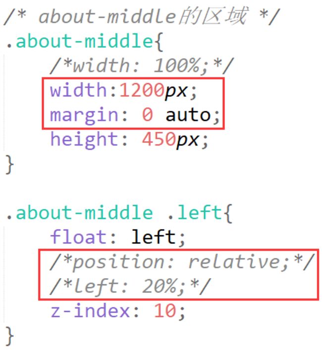
.about-middle{
width: 100%;
height: 450px;
}
.about-middle .left{
float: left;
position: relative;
left: 20%;
z-index: 10;
}
.about-middle .left .word{
font-size: 40px;
width: 250px;
text-align: center;
}
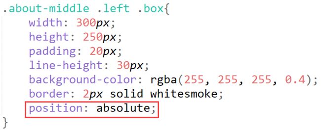
.about-middle .left .box{
width: 300px;
height: 250px;
padding: 20px;
line-height: 30px;
background-color: rgba(255, 255, 255, 0.4);
border: 2px solid whitesmoke;
}
.about-middle .left .box input{
height: 40px;
width: 100px;
margin: 20px auto;
border: 0px;
color: #ffffff;
background-color: #000;
}
.about-middle .left .box input:hover{
background-color: transparent;
border: 2px solid #000;
color: black;
}
.about-middle .middle{
width: 100%;
float: left;
position: absolute;
text-align: center;
}
/* about中间靠右边的区域 */
.about-middle .right{
float: right;
position: absolute;
right: 18%;
}
.about-middle .right .board{
height: 150px;
width: 250px;
border: 1px solid #07cbc9;
}
.about-middle .right .board .num{
font-size: 36px;
font-weight: 700;
margin-top: 20px;
}
.about-middle .right ul li{
list-style: none;
margin-bottom: 40px;
text-align: center;
}
.about-middle .right .underline{
margin: 10px auto;
background-color: #07cbc9;
width: 40px;
height: 2px;
text-align: center;
}
/* about底部的区域 */
.about-bottom{
width: 100%;
height: 900px;
}
.about-bottom ul{
margin-top: 80px;
}
.about .bottom .img{
width: 50%;
height: 100%;
float: left;
overflow:hidden;
}
.about .bottom .img img{
width: 100%;
}
.about-bottom ul li{
line-height: 30px;
list-style: none;
height: 395px;
width: 450px;
float: left;
}
.about-bottom .para{
box-sizing: border-box;
padding-left: 30px;
padding-top: 20px;
padding-right: 20px;
height: 395px;
width: 450px;
color: #ffffff;
background-color: #07cbc9;
}
.about-bottom .para .title{
font-size: 28px;
margin-bottom: 20px;
}
.about-bottom .abstract{
font-size: 20px;
margin-bottom: 20px;
}
.about-bottom .para .btn{
text-align: center;
}
.about-bottom .para input{
height: 40px;
width: 100px;
margin-top: 40px;
color: #ffffff;
background-color: #000;
border: none;
}
.about-bottom .para input:hover{
border: 1px solid #000;
color: #000;
background-color: transparent;
}
/* gallery上半部分的内容 */
.gallery{
width: 100%;
}
.gallery .top .about{
font-size: 60px;
font-weight: 700;
margin-top: 30px;
text-align: center;
}
.gallery .top .underline{
margin: 5px auto;
background-color: #07cbc9;
width: 40px;
height: 2px;
text-align: center;
}
.gallery .top .para{
margin: 10px auto;
width: 500px;
line-height: 30px;
margin-bottom:20px;
text-align: center;
}
/* gallery下半部分的内容 */
.gallery .bottom{
width: 1260px;
height: 600px;
position: relative;
left: 20%
}
.gallery .bottom ul li{
position: relative;
list-style: none;
width: 360px;
height: 240px;
margin-right: 60px;
margin-bottom: 60px;
float: left;
background-color: #07cbc9;
}
.gallery .bottom .title{
position: absolute;
bottom: -60px;
width: 360px;
height: 60px;
background-color: #000;
color: #ffffff;
line-height: 60px;
margin-bottom: 30px;
padding-left: 20px;
box-sizing: border-box;
}
/* 页脚 */
.foot{
width: 100%;
height: 80px;
line-height: 80px;
text-align: center;
background-color: #07cbc9;
color: #ffffff;
}
12
收起
正在回答
1回答
同学,你好!
1、可以设置li的pading值,使左右两边都有边距

2、可以设置外层div的固定宽度,设置margin使其水平居中,只有左下角设置position,其他部分只设置浮动即可
参考代码:
3、ABOUT下的8张图片不需要居中显示,可以设置li的width为25%,使其一行四列显示,再设置img的width和height为100%即可
4、同学的代码实现了居中效果
5、img与div的下边界默认是会有一点空隙的,可以图片添加vertical-align: bottom;属性
祝学习愉快!
相似问题
width值不为固定数值时,如何设置块级元素垂直水平居中
21
0
3


如何让文字垂直居中?如何让六个元素居中?
16
1
3


about图片居中
12
0
1
如何设置中间浮动的盒子居中呢?
12
0
3


logo的图片如何垂直居中?
44
0
6


登录后可查看更多问答,登录/注册
Python全栈工程师2020
- 参与学习 人
- 提交作业 5317 份
- 解答问题 2433 个
Facebook曾声称“只招全栈工程师”!全栈用人需求猛增,市面人才紧缺。 0基础进击Python全栈开发,诱人薪资在前方!
了解课程


恭喜解决一个难题,获得1积分~
来为老师/同学的回答评分吧
0 星