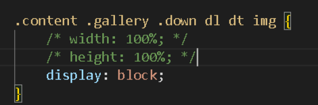
图片右侧清除外边距 文字压盖 代码优化
相关代码:
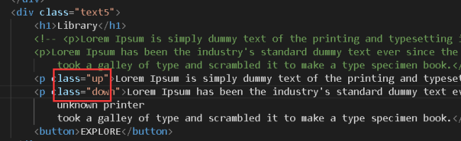
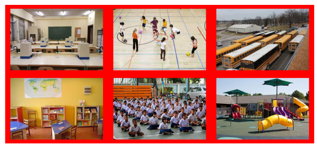
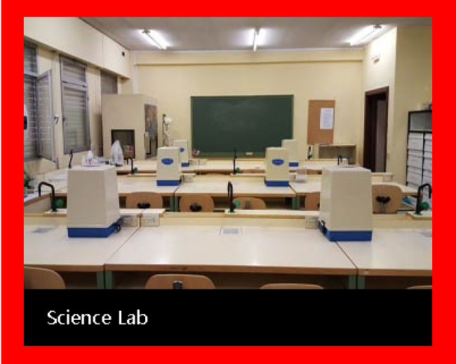
<!DOCTYPE html> <html lang="en"> <head> <meta charset="UTF-8"> <meta http-equiv="X-UA-Compatible" content="IE=edge"> <meta name="viewport" content="width=device-width, initial-scale=1.0"> <title>练习</title> <link rel="stylesheet" href="css/css.css"> </head> <body> <!-- 网页头部 --> <header> <div class="center"> <!-- logo --> <div class="logo"> <img src="images/logo.png"> </div> <!-- 导航条--> <div class="nav"> <ul> <li>HOME</li> <li>ABOUT</li> <li>GALLERY</li> <li>FACULTY</li> <li>EVENTS</li> <li>CONTACT</li> </ul> </div> </div> </header> <!-- 网页横幅 --> <section class="banner"> <!-- 放大的图片 --> <img src="images/banner3.jpg"> <!-- 遮罩层 --> <div class="banner-mask"></div> <!-- 表单 --> <div class="banner-form"> <form action="" method="post"> <input type="text" placeholder="your Name"> <input type="text" placeholder="your Phone"> <input type="email" placeholder="your Email"> <textarea placeholder="Write Your Comment Here" rows="4" cols="50"></textarea> <p> <input type="submit" value="SEND MESSAGE"> </p> </form> </div> </section> <!-- 网页的主要内容 --> <section class="content"> <!-- 网页about区域 --> <div class="about"> <!-- about上半部分 --> <div class="up"> <h1>ABOUT</h1> <div class="line"></div> <span> Ipsum is simply dummy text of the printing and typesetting<br> industry. Lorem Ipsum has been the industry's standard dummy<br> text ever since the 1500s. </span> </div> <!-- about下半部分 --> <div class="down"> <!-- 下半部分左侧 --> <div class="left"> <h1>WORD<br>ABOUT US</h1> <div class="jdms"> <p> Praesent dignissim viverra est, sed bibendum ligula congue non. Sed ac nisl et felis gravida commodo? Suspendisse eget ullamcorper ipsum. Suspendisse diam amet. </p> <button>EXPLORE</button> </div> </div> <!-- 下半部分中间 --> <div class="center"> <img src="IMAGES/bb3.jpg"> </div> <!-- 下半部分右侧 --> <div class="right"> <div class="top"> <p>70000</p> <div class="line-top"></div> Students </div> <div class="down"> <p>600</p> <div class="line-down"></div> Faculty </div> </div> </div> </div> <!-- 网页图文混排区域 --> <div class="image-text"> <div class="image1"> <img src="images/b1.jpg"> </div> <div class="text2"> <h1>Library</h1> <p class="up">Lorem Ipsum is simply dummy text of the printing and typesetting industry</p> <p class="down">Lorem Ipsum has been the industry's standard dummy text ever since the 1500s, when an unknown printer took a galley of type and scrambled it to make a type specimen book.</p> <button>EXPLORE</button> </div> <div class="image3"> <img src="images/b2.jpg"> </div> <div class="text3"> <h1>Library</h1> <p class="up">Lorem Ipsum is simply dummy text of the printing and typesetting industry</p> <p class="down">Lorem Ipsum has been the industry's standard dummy text ever since the 1500s, when an unknown printer took a galley of type and scrambled it to make a type specimen book.</p> <button>EXPLORE</button> </div> <div class="text4"> <h1>Library</h1> <p class="up">Lorem Ipsum is simply dummy text of the printing and typesetting industry</p> <p class="down">Lorem Ipsum has been the industry's standard dummy text ever since the 1500s, when an unknown printer took a galley of type and scrambled it to make a type specimen book.</p> <button>EXPLORE</button> </div> <div class="image6"> <img src="images/b3.jpg"> </div> <div class="text5"> <h1>Library</h1> <p>Lorem Ipsum is simply dummy text of the printing and typesetting industry</p> <p>Lorem Ipsum has been the industry's standard dummy text ever since the 1500s, when an unknown printer took a galley of type and scrambled it to make a type specimen book.</p> <button>EXPLORE</button> </div> <div class="image8"> <img src="images/b4.jpg"> </div> </div> <!-- 网页Gallery区域 --> <div class="gallery"> <!-- gallery上部分 --> <div class="up"> <h1>GALLERY</h1> <div class="line"></div> <span> Lorem Ipsum is simply dummy text of the printing and typesetting<br> industry. Lorem Ipsum has been the industry's standard dummy<br> text ever since the 1500s. </span> </div> <!-- gallery下部分 --> <div class="down"> <dl> <dt> <img src="images/03-01.jpg"> </dt> <dd>Science Lab</dd> </dl> <dl> <dt> <img src="images/03-02.jpg"> </dt> <dd>Indoor Stadium</dd> </dl> <dl> <dt> <img src="images/03-03.jpg"> </dt> <dd>Transportation</dd> </dl> <dl> <dt> <img src="images/03-04.jpg"> </dt> <dd>Kids Room</dd> </dl> <dl> <dt> <img src="images/03-05.jpg"> </dt> <dd>Meditation Classes</dd> </dl> <dl> <dt> <img src="images/03-06.jpg"> </dt> <dd>Kid Play Ground</dd> </dl> </div> </div> </section> <!-- 网页页脚 --> <footer> <p>©2016imooc.com京ICP备13046642</p> </footer> </body> </html>
相关代码:
* {
margin: 0;
padding: 0;
}
/* 去掉列表小圆点 */
ul {
list-style: none;
}
/* 头部 */
header {
width: 100%;
height: 80px;
background-color: #07cbc9;
}
header .center {
width: 1200px;
height: 100%;
/* 盒子水平居中 */
margin: 0 auto;
}
header .center .logo {
float: left;
height: 48px;
margin-top: 16px;
}
header .center .nav {
float: right;
/* 行高等于盒子高,实现单行文本垂直居中 */
height: 80px;
line-height: 80px;
}
header .center .nav ul li {
float: left;
font-size: 16px;
color: white;
margin-left: 20px;
}
/* 网页横幅 */
.banner {
height: 600px;
position: relative;
}
.banner img {
width: 100%;
height: 600px;
}
.banner .banner-mask {
position: absolute;
top: 0;
height: 600px;
width: 100%;
background-color: rgba(0, 0, 0, 0.5);
}
.banner .banner-form {
position: absolute;
top: 100px;
width: 504px;
left: 50%;
margin-left: -252px;
}
.banner .banner-form form input {
width: 504px;
height: 40px;
background: none;
color: #808080;
border: 1px solid #808080;
margin-bottom: 20px;
}
.banner .banner-form form textarea{
width: 504px;
height: 110px;
background: none;
color: #808080;
border: 1px solid #808080;
margin-bottom: 20px;
}
.banner .banner-form form p input{
width: 200px;
height: 40px;
}
.banner .banner-form form p {
text-align: center;
}
/* about区域 */
.content .about{
width: 1201px;
margin: 0 auto;
margin-top: 30px;
}
.content .about .up{
text-align: center;
}
.content .about .up h1{
font-size: 32px;
}
.content .about .up .line{
width: 60px;
height: 3px;
background-color: #07cbc9;
margin:10px auto;
}
.content .about .up span{
text-align: center;
color: gray;
font-size: 14px;
}
.content .about .down{
position: relative;
width: 1201px;
height: 464px;
overflow: hidden;
padding-top: 30px;
}
.content .about .down .left {
float: left;
}
.content .about .down .left .jdms{
position: absolute;
width: 340px;
padding: 20px;
border: 1px solid gray;
background-color: rgba(255,255,255,0.5);
margin-top: 30px;
}
.content .about .down .left .jdms p{
font-size: 18px;
}
.content .about .down .left .jdms button{
background-color: black;
color: white;
border: none;
width: 140px;
height: 40px;
margin-top: 20px;
}
.content .about .down .center{
float: left;
margin-left: 147px;
}
.content .about .down .center img{
width: 650px;
height: 435px;
}
.content .about .down .right{
float: right;
overflow: hidden;
}
.content .about .down .right .top{
border: 1px solid #07cbc9;
width: 260px;
margin-bottom: 30px;
text-align: center;
padding: 40px 0;
}
.content .about .down .right .top p{
font-size: 28px;
font-weight: bold;
}
.content .about .down .right .top .line-top{
width: 60px;
height: 3px;
background-color: #07cbc9;
margin:10px auto;
}
.content .about .down .right .down{
border: 1px solid #07cbc9;
width: 260px;
height: 100%;
text-align: center;
padding-bottom: 40px;
}
.content .about .down .right .down p{
font-size: 28px;
font-weight: bold;
}
.content .about .down .right .down .line-down{
width: 60px;
height: 3px;
background-color: #07cbc9;
margin:10px auto;
}
/* 图文混排区域 */
.content .image-text{
width: 100%;
overflow: hidden;
background-color: #07cbc9;
}
.content .image-text img{
/* 使图片撑满整个盒子 */
width: 100%;
height: 100%;
/* img是行内元素,默认存在间隙,转为块级元素,消除间隙 */
display: block;
}
.content .image-text>div{
width: 25%;
height: 380px;
float: left;
}
.content .image-text h1{
font-size: 24px;
margin-top: 20px;
margin-left: 20px;
margin-bottom: 30px;
color: white;
}
.content .image-text .up{
margin-left: 20px;
margin-bottom: 20px;
font-size: 16px;
color: white;
}
.content .image-text .down{
margin-left: 20px;
margin-bottom: 30px;
font-size: 14px;
color: gray;
}
.content .image-text button{
display: block;
margin:0 auto;
background-color: black;
color: white;
border: none;
width: 138px;
height: 40px;
}
/* Gallery区域 */
.content .gallery{
width: 1201px;
margin: 0 auto;
margin-top: 30px;
}
.content .gallery .up{
text-align: center;
}
.content .gallery .up h1{
font-size: 32px;
}
.content .gallery .up .line{
width: 60px;
height: 3px;
background-color: #07cbc9;
margin:10px auto;
}
.content .gallery .up span{
text-align: center;
color: gray;
font-size: 14px;
}
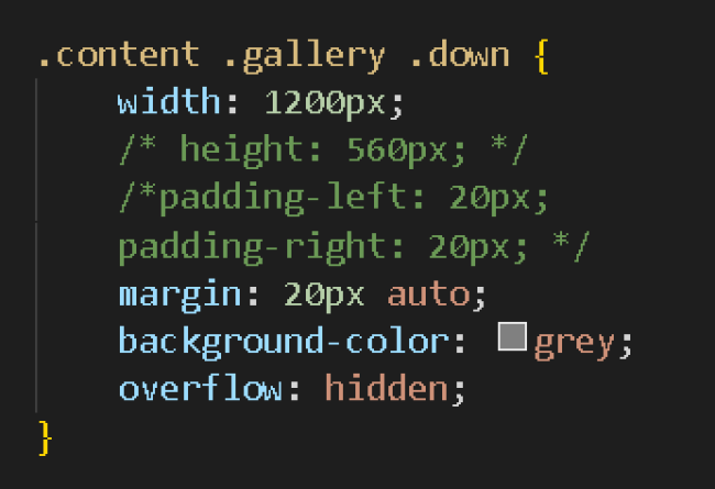
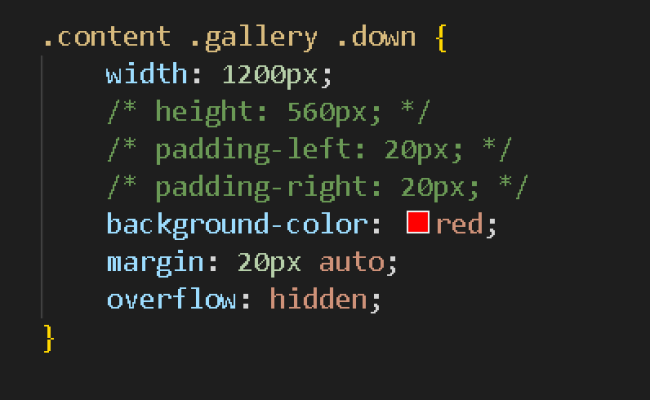
.content .gallery .down{
width: 1200px;
height: 560px;
padding-left: 20px;
padding-right: 20px;
background-color: red;
}
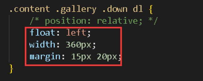
.content .gallery .down dl{
position: relative;
}
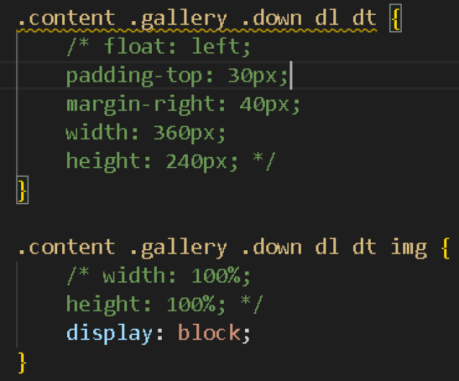
.content .gallery .down dl dt{
float: left;
padding-top: 30px;
margin-right: 40px;
width: 360px;
height: 240px;
}
.content .gallery .down dl dt img{
width: 100%;
height: 100%;
}
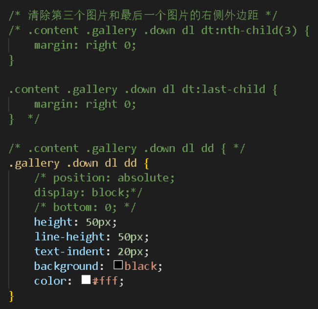
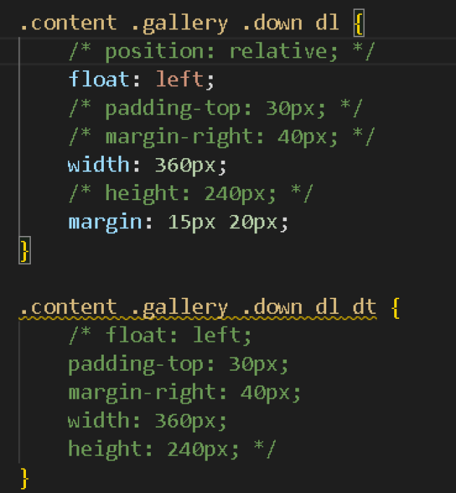
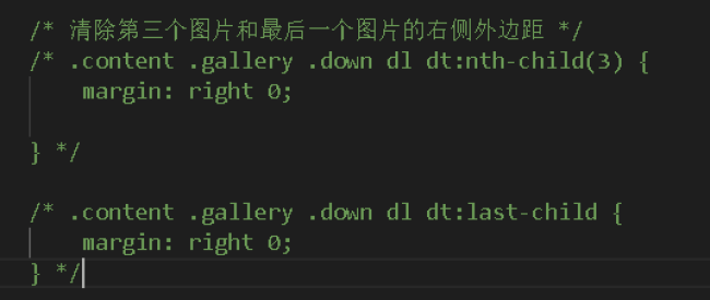
/* 清除第三个图片和最后一个图片的右侧外边距 */
.content .gallery .down dl dt:nth-child(3){
margin: right 0;
}
.content .gallery .down dl dt:last-child{
margin: right 0;
}
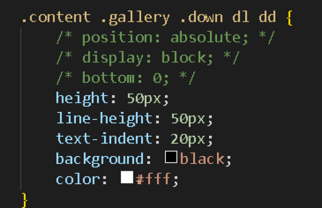
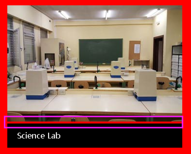
.content .gallery .down dl dd{
position: absolute;
display: block;
bottom: 0;
}
footer{
background-color: #07cbc9;
width: 100%;
height: 80px;
}
footer p{
text-align: center;
line-height: 80px;
}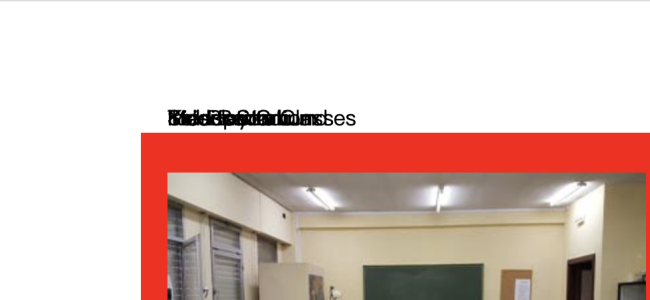
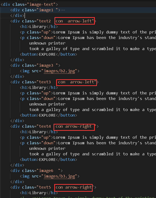
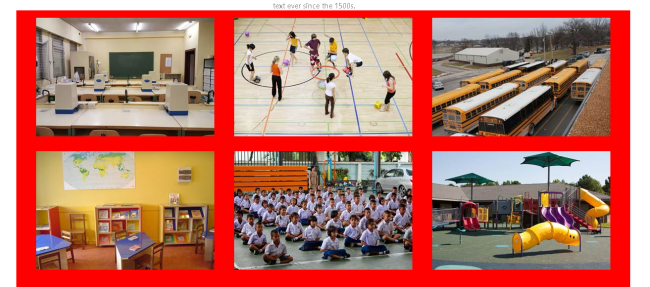
图片上的文字要怎么浮动在图片上呢?而且位于最下方
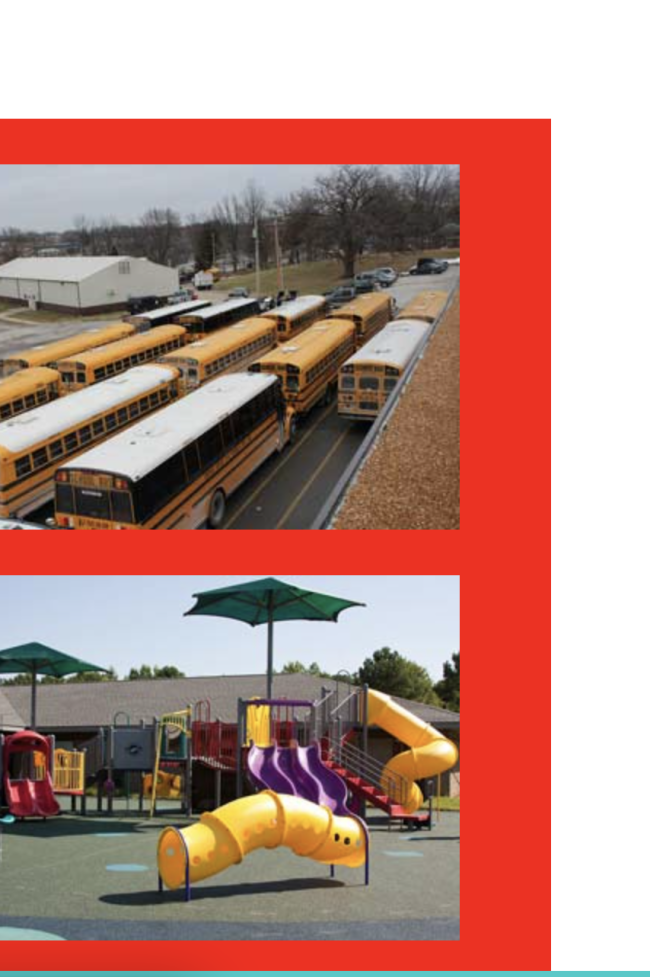
最右边这两个图片设置了取消外边距但是没有效果
另外再麻烦老师帮我看看其他的代码有没有可以优化的地方。谢谢老师啦~
24
收起
正在回答 回答被采纳积分+1
1回答


恭喜解决一个难题,获得1积分~
来为老师/同学的回答评分吧
0 星