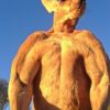
CSS绘制小兔子,请老师点评。
完整代码如下(因为考虑浏览器兼容性,所以代码稍多):
HTML
<div class="BlueSky"> <!--蓝天-->
   <div class="cloud one"></div> <!--云朵1-->
   <div class="cloud two"></div> <!--云朵2-->
   <div class="cloud three"></div> <!--云朵3-->
   <div class="cloud four"></div> <!--云朵4-->
   <div class="cloud five"></div> <!--云朵5-->
</div>
<div class="GreenGrassland"> <!--绿地-->
   <div class="rabbit"> <!--兔子-->
      <div class="face"></div> <!--脸-->
      <div class="LeftEye"></div> <!--左眼-->
      <div class="RightEye"></div> <!--右眼-->
      <div class="nose"></div> <!--鼻子-->
      <div class="LeftLip"></div> <!--左嘴唇-->
      <div class="RightLip"></div> <!--右嘴唇-->
      <div class="beard"></div> <!--胡须-->
      <div class="beard right"></div> <!--右胡须-->
      <div class="LeftEar"></div> <!--左耳朵-->
      <div class="RightEar"></div> <!--右耳朵-->
      <div class="body"> <!--身体部分-->
         <div class="LeftHand"></div> <!--左手-->
         <div class="RightHand"></div> <!--右手-->
         <div class="leg"></div> <!--腿-->
      </div>
      <div class="tail"></div> <!--尾巴-->
   </div>
</div>
CSS
:root
{
    --time1: 10s; /*云朵1动画时间*/
    --time2: 14s; /*云朵2动画时间*/
    --time3: 12s; /*云朵3动画时间*/
    --time4: 12s; /*云朵4动画时间*/
    --time5: 16s; /*云朵5动画时间*/
}

body
{
    overflow: hidden; /*防止窗口出现滚动条*/
    margin: 0;
    padding: 0;
    width: 100%;
    height: 100vh; /*整体高度100vh*/
}

.BlueSky /*蓝天*/
{
    position: relative;
    width: 100%;
    height: 60vh; /*蓝天高度占60%*/
    background-image: -webkit-linear-gradient(to bottom, rgba(196, 228, 253, 1), rgba(196, 228, 253, 0));
    background-image: -moz-linear-gradient(to bottom, rgba(196, 228, 253, 1), rgba(196, 228, 253, 0));
    background-image: -o-linear-gradient(to bottom, rgba(196, 228, 253, 1), rgba(196, 228, 253, 0));
    background-image: -ms-linear-gradient(to bottom, rgba(196, 228, 253, 1), rgba(196, 228, 253, 0));
    background-image: linear-gradient(to bottom, rgba(196, 228, 253, 1), rgba(196, 228, 253, 0));
    z-index: -2;
}

.GreenGrassland /*绿地*/
{
    position: relative;
    width: 100%;
    height: 40vh; /*绿地高度占40%*/
    background-image: -webkit-linear-gradient(to top, rgba(148, 190, 89, 1), rgba(148, 190, 89, 0));
    background-image: -moz-linear-gradient(to top, rgba(148, 190, 89, 1), rgba(148, 190, 89, 0));
    background-image: -o-linear-gradient(to top, rgba(148, 190, 89, 1), rgba(148, 190, 89, 0));
    background-image: -ms-linear-gradient(to top, rgba(148, 190, 89, 1), rgba(148, 190, 89, 0));
    background-image: linear-gradient(to top, rgba(148, 190, 89, 1), rgba(148, 190, 89, 0));
    z-index: -2;
}

.cloud /*云朵*/
{
    position: absolute;
    border-radius: 14%/50%;
    width: 210px;
    height: 60px;
    background-color: #FFF;
}

.cloud::before,
.cloud::after,
.LeftEye::after,
.RightEye::after,
.nose::before,
.beard::before,
.beard::after,
.leg::after /*before和after伪元素的通用样式*/
{
    content: "";
    display: block;
    position: absolute;
}

.cloud::before
{
    left: 8%;
    top: -28%;
    -webkit-transform: rotate(-30deg);
    -moz-transform: rotate(-30deg);
    -o-transform: rotate(-30deg);
    -ms-transform: rotate(-30deg);
    transform: rotate(-30deg);
    border-radius: 50%/30%;
    width: 70px;
    height: 86px;
    background-color: #FFF;
}

.cloud::after
{
    left: 30%;
    top: -98%;
    border-radius: 50% 50% 50% 38%/50%;
    width: 130px;
    height: 128px;
    background-color: #FFF;
}

.cloud.one /*云朵1*/
{
    top: 25%;
    left: 50%;
    -webkit-transform: scale(1.3); /*放大1.3倍*/
    -moz-transform: scale(1.3);
    -o-transform: scale(1.3);
    -ms-transform: scale(1.3);
    transform: scale(1.3);
    -webkit-animation: CloudOneAnimation var(--time1) linear infinite;
    -moz-animation: CloudOneAnimation var(--time1) linear infinite;
    -o-animation: CloudOneAnimation var(--time1) linear infinite;
    -ms-animation: CloudOneAnimation var(--time1) linear infinite;
    animation: CloudOneAnimation var(--time1) linear infinite;
}

@-webkit-keyframes CloudOneAnimation /*云朵1动画*/
{
    0%
    {left: 100%}
    100%
    {left: -40%;}
}

@-moz-keyframes CloudOneAnimation /*云朵1动画*/
{
    0%
    {left: 100%}
    100%
    {left: -40%;}
}

@-o-keyframes CloudOneAnimation /*云朵1动画*/
{
    0%
    {left: 100%}
    100%
    {left: -40%;}
}

@-ms-keyframes CloudOneAnimation /*云朵1动画*/
{
    0%
    {left: 100%}
    100%
    {left: -40%;}
}

@keyframes CloudOneAnimation /*云朵1动画*/
{
    0%
    {left: 100%}
    100%
    {left: -40%;}
}

.cloud.two /*云朵2*/
{
    top: 6%;
    left: 10%;
    opacity: .9; /*透明度90%*/
    -webkit-animation: CloudTwoAnimation var(--time2) linear infinite;
    -moz-animation: CloudTwoAnimation var(--time2) linear infinite;
    -o-animation: CloudTwoAnimation var(--time2) linear infinite;
    -ms-animation: CloudTwoAnimation var(--time2) linear infinite;
    animation: CloudTwoAnimation var(--time2) linear infinite;
}

@-webkit-keyframes CloudTwoAnimation /*云朵2动画*/
{
    0%
    {left: 80%}
    100%
    {left: -20%}
}

@-moz-keyframes CloudTwoAnimation /*云朵2动画*/
{
    0%
    {left: 80%}
    100%
    {left: -20%}
}

@-o-keyframes CloudTwoAnimation /*云朵2动画*/
{
    0%
    {left: 80%}
    100%
    {left: -20%}
}

@-ms-keyframes CloudTwoAnimation /*云朵2动画*/
{
    0%
    {left: 80%}
    100%
    {left: -20%}
}

@keyframes CloudTwoAnimation /*云朵2动画*/
{
    0%
    {left: 80%}
    100%
    {left: -20%}
}

.cloud.three /*云朵3*/
{
    top: 50%;
    left: 30%;
    -webkit-transform: scale(.9); /*缩小为原来的90%*/
    -moz-transform: scale(.9);
    -o-transform: scale(.9);
    -ms-transform: scale(.9);
    transform: scale(.9);
    opacity: .8; /*透明度80%*/
    -webkit-animation: CloudThreeAnimation var(--time3) linear infinite;
    -moz-animation: CloudThreeAnimation var(--time3) linear infinite;
    -o-animation: CloudThreeAnimation var(--time3) linear infinite;
    -ms-animation: CloudThreeAnimation var(--time3) linear infinite;
    animation: CloudThreeAnimation var(--time3) linear infinite;
}

@-webkit-keyframes CloudThreeAnimation /*云朵3动画*/
{
    0%
    {left: 30%}
    100%
    {left: -20%}
}

@-moz-keyframes CloudThreeAnimation /*云朵3动画*/
{
    0%
    {left: 30%}
    100%
    {left: -20%}
}

@-o-keyframes CloudThreeAnimation /*云朵3动画*/
{
    0%
    {left: 30%}
    100%
    {left: -20%}
}

@-ms-keyframes CloudThreeAnimation /*云朵3动画*/
{
    0%
    {left: 30%}
    100%
    {left: -20%}
}

@keyframes CloudThreeAnimation /*云朵3动画*/
{
    0%
    {left: 30%}
    100%
    {left: -20%}
}

.cloud.four /*云朵4*/
{
    top: 8%;
    left: 70%;
    -webkit-transform: scale(.8); /*缩小为原来的80%*/
    -moz-transform: scale(.8);
    -o-transform: scale(.8);
    -ms-transform: scale(.8);
    transform: scale(.8);
    opacity: .7; /*透明度70%*/
    -webkit-animation: CloudFourAnimation var(--time4) linear infinite;
    -moz-animation: CloudFourAnimation var(--time4) linear infinite;
    -o-animation: CloudFourAnimation var(--time4) linear infinite;
    -ms-animation: CloudFourAnimation var(--time4) linear infinite;
    animation: CloudFourAnimation var(--time4) linear infinite;
}

@-webkit-keyframes CloudFourAnimation /*云朵4动画*/
{
    0%
    {left: 70%}
    100%
    {left: -20%}
}

@-moz-keyframes CloudFourAnimation /*云朵4动画*/
{
    0%
    {left: 70%}
    100%
    {left: -20%}
}

@-o-keyframes CloudFourAnimation /*云朵4动画*/
{
    0%
    {left: 70%}
    100%
    {left: -20%}
}

@-ms-keyframes CloudFourAnimation /*云朵4动画*/
{
    0%
    {left: 70%}
    100%
    {left: -20%}
}

@keyframes CloudFourAnimation /*云朵4动画*/
{
    0%
    {left: 70%}
    100%
    {left: -20%}
}

.cloud.five /*云朵5*/
{
    top: 50%;
    left: 65%;
    -webkit-transform: scale(.72); /*缩小为原来的72%*/
    -moz-transform: scale(.72);
    -o-transform: scale(.72);
    -ms-transform: scale(.72);
    transform: scale(.72);
    opacity: .6; /*透明度60%*/
    -webkit-animation: CloudFiveAnimation var(--time5) linear infinite;
    -moz-animation: CloudFiveAnimation var(--time5) linear infinite;
    -o-animation: CloudFiveAnimation var(--time5) linear infinite;
    -ms-animation: CloudFiveAnimation var(--time5) linear infinite;
    animation: CloudFiveAnimation var(--time5) linear infinite;
}

@-webkit-keyframes CloudFiveAnimation /*云朵5动画*/
{
    0%
    {left: 100%;}
    100%
    {left: -15%;}
}

@-moz-keyframes CloudFiveAnimation /*云朵5动画*/
{
    0%
    {left: 100%;}
    100%
    {left: -15%;}
}

@-o-keyframes CloudFiveAnimation /*云朵5动画*/
{
    0%
    {left: 100%;}
    100%
    {left: -15%;}
}

@-ms-keyframes CloudFiveAnimation /*云朵5动画*/
{
    0%
    {left: 100%;}
    100%
    {left: -15%;}
}

@keyframes CloudFiveAnimation /*云朵5动画*/
{
    0%
    {left: 100%;}
    100%
    {left: -15%;}
}

.rabbit /*兔子*/
{
    position: absolute;
    bottom: 5%;
    right: 10%;
    width: 300px;
    height: 250px;
}

.face /*脸*/
{
    position: absolute;
    left: 2%;
    top: 18%;
    -webkit-transform: rotate(-35deg);
    -moz-transform: rotate(-35deg);
    -o-transform: rotate(-35deg);
    -ms-transform: rotate(-35deg);
    transform: rotate(-35deg);
    border-radius: 50%/ 50% 36% 50% 50%;
    width: 120px;
    height: 120px;
    background-color: #FFF;
    z-index: 0;
}

.LeftEye /*左眼*/
{
    position: absolute;
    left: 11%;
    top: 16%;
    -webkit-transform: rotate(60deg);
    -moz-transform: rotate(60deg);
    -o-transform: rotate(60deg);
    -ms-transform: rotate(60deg);
    transform: rotate(60deg);
    border-radius: 26% 70% 70% 25%/ 50%;
    width: 18px;
    height: 40px;
    background-color: #838383;
}

.LeftEye::after
{
    left: 3%;
    top: 19%;
    border-radius: 34% 50% 50% 30%/50%;
    width: 6px;
    height: 12px;
    background-color: #FFF;
}

.RightEye /*右眼*/
{
    position: absolute;
    left: 24%;
    top: 30%;
    -webkit-transform: rotate(45deg);
    -moz-transform: rotate(45deg);
    -o-transform: rotate(45deg);
    -ms-transform: rotate(45deg);
    transform: rotate(45deg);
    border-radius: 45% 45% 48% 40%/ 50% 30% 50% 50%;
    width: 24px;
    height: 38px;
    background-color: #838383;
}

.RightEye::after
{
    left: 28%;
    top: 18%;
    border-radius: 48% 50% 50%/50%;
    width: 8px;
    height: 12px;
    background-color: #FFF;
}

.nose /*鼻子*/
{
    position: absolute;
    left: 4%;
    top: 34%;
    -webkit-transform: rotate(42deg);
    -moz-transform: rotate(42deg);
    -o-transform: rotate(42deg);
    -ms-transform: rotate(42deg);
    transform: rotate(42deg);
    border-width: 20px;
    border-style: solid;
    border-color: #7E7E7F transparent transparent transparent;
    border-radius: 50%;
    width: 2px;
    height: 2px;
}

.nose::before
{
    left: -14px;
    top: -20px;
    border-radius: 50%;
    width: 30px;
    height: 10px;
    background-color: #7E7E7F;
}

.LeftLip /*左嘴唇*/
{
    position: absolute;
    left: 5%;
    top: 39%;
    -webkit-transform: rotate(46deg);
    -moz-transform: rotate(46deg);
    -o-transform: rotate(46deg);
    -ms-transform: rotate(46deg);
    transform: rotate(46deg);
    border-width: 1px;
    border-style: solid;
    border-color: transparent #7E7E7F #7E7E7F #7E7E7F;
    border-radius: 58% 40% 76% 40%/44% 10% 80% 68%;
    width: 15px;
    height: 8px;
    background-color: transparent;
}

.RightLip /*右嘴唇*/
{
    position: absolute;
    left: 8%;
    top: 44%;
    -webkit-transform: rotate(60deg);
    -moz-transform: rotate(60deg);
    -o-transform: rotate(60deg);
    -ms-transform: rotate(60deg);
    transform: rotate(60deg);
    border-width: 1px;
    border-style: solid;
    border-color: transparent #7E7E7F #7E7E7F #7E7E7F;
    border-radius: 50%;
    width: 24px;
    height: 12px;
    background-color: transparent;
}

.beard /*胡须*/
{
    position: absolute;
    left: -6%;
    top: 19%;
    -webkit-transform: rotate(50deg);
    -moz-transform: rotate(50deg);
    -o-transform: rotate(50deg);
    -ms-transform: rotate(50deg);
    transform: rotate(50deg);
    border-top: 1px solid #7E7E7F;
    border-radius: 42% 0 0/40% 0 0;
    width: 30px;
    height: 16px;
    background-color: transparent;
}

.beard::before
{
    left: 30%;
    top: 114%;
    -webkit-transform: rotate(-25deg);
    -moz-transform: rotate(-25deg);
    -o-transform: rotate(-25deg);
    -ms-transform: rotate(-25deg);
    transform: rotate(-25deg);
    border-top: 1px solid #7E7E7F;
    border-radius: 42% 0 0/40% 0 0;
    width: 30px;
    height: 16px;
    background-color: transparent;
}

.beard::after
{
    left: 25%;
    top: -209%;
    -webkit-transform: rotate(27deg);
    -moz-transform: rotate(27deg);
    -o-transform: rotate(27deg);
    -ms-transform: rotate(27deg);
    transform: rotate(27deg);
    border-bottom: 1px solid #7E7E7F;
    border-radius: 50%/0 0 0 18%;
    width: 30px;
    height: 16px;
    background-color: transparent;
}

.beard.right /*右胡须*/
{
    -webkit-transform: scale(-1, 1) rotate(-42deg) translate(-120px, 22px);
    -moz-transform: scale(-1, 1) rotate(-42deg) translate(-120px, 22px);
    -o-transform: scale(-1, 1) rotate(-42deg) translate(-120px, 22px);
    -ms-transform: scale(-1, 1) rotate(-42deg) translate(-120px, 22px);
    transform: scale(-1, 1) rotate(-42deg) translate(-120px, 22px);
}

.LeftEar /*左耳朵*/
{
    -webkit-transform: rotate(40deg) translate(65px, -110px);
    -moz-transform: rotate(40deg) translate(65px, -110px);
    -o-transform: rotate(40deg) translate(65px, -110px);
    -ms-transform: rotate(40deg) translate(65px, -110px);
    transform: rotate(40deg) translate(65px, -110px);
    border-radius: 50% 50% 40% 40%/50%;
    width: 30px;
    height: 108px;
    background-image: -webkit-linear-gradient(45deg, #DCDCCC, #FFF);
    background-image: -moz-linear-gradient(45deg, #DCDCCC, #FFF);
    background-image: -o-linear-gradient(45deg, #DCDCCC, #FFF);
    background-image: -ms-linear-gradient(45deg, #DCDCCC, #FFF);
    background-image: linear-gradient(45deg, #DCDCCC, #FFF);
    z-index: -1;
    -webkit-animation: LeftEarAnimation .6s ease-in-out infinite;
    -moz-animation: LeftEarAnimation .6s ease-in-out infinite;
    -o-animation: LeftEarAnimation .6s ease-in-out infinite;
    -ms-animation: LeftEarAnimation .6s ease-in-out infinite;
    animation: LeftEarAnimation .6s ease-in-out infinite;
}

@-webkit-keyframes LeftEarAnimation /*左耳朵动画*/
{
    0%
    {transform: rotate(40deg) translate(65px, -110px);}
    50%
    {transform: rotate(48deg) translate(66px, -120px);}
    100%
    {transform: rotate(40deg) translate(65px, -110px);}
}

@-moz-keyframes LeftEarAnimation /*左耳朵动画*/
{
    0%
    {transform: rotate(40deg) translate(65px, -110px);}
    50%
    {transform: rotate(48deg) translate(66px, -120px);}
    100%
    {transform: rotate(40deg) translate(65px, -110px);}
}

@-ms-keyframes LeftEarAnimation /*左耳朵动画*/
{
    0%
    {transform: rotate(40deg) translate(65px, -110px);}
    50%
    {transform: rotate(48deg) translate(66px, -120px);}
    100%
    {transform: rotate(40deg) translate(65px, -110px);}
}

@-o-keyframes LeftEarAnimation /*左耳朵动画*/
{
    0%
    {transform: rotate(40deg) translate(65px, -110px);}
    50%
    {transform: rotate(48deg) translate(66px, -120px);}
    100%
    {transform: rotate(40deg) translate(65px, -110px);}
}

@keyframes LeftEarAnimation /*左耳朵动画*/
{
    0%
    {transform: rotate(40deg) translate(65px, -110px);}
    50%
    {transform: rotate(48deg) translate(66px, -120px);}
    100%
    {transform: rotate(40deg) translate(65px, -110px);}
}

.RightEar /*右耳朵*/
{
    -webkit-transform: rotate(65deg) translate(-24px, -184px);
    -moz-transform: rotate(65deg) translate(-24px, -184px);
    -o-transform: rotate(65deg) translate(-24px, -184px);
    -ms-transform: rotate(65deg) translate(-24px, -184px);
    transform: rotate(65deg) translate(-24px, -184px);
    border-radius: 50% 50% 40% 40%/50%;
    width: 30px;
    height: 108px;
    background-image: -webkit-linear-gradient(45deg, #DCDCCC, #FFF);
    background-image: -moz-linear-gradient(45deg, #DCDCCC, #FFF);
    background-image: -o-linear-gradient(45deg, #DCDCCC, #FFF);
    background-image: -ms-linear-gradient(45deg, #DCDCCC, #FFF);
    background-image: linear-gradient(45deg, #DCDCCC, #FFF);
    z-index: -1;
    -webkit-animation: RightEarAnimation .6s ease-in-out infinite;
    -moz-animation: RightEarAnimation .6s ease-in-out infinite;
    -o-animation: RightEarAnimation .6s ease-in-out infinite;
    -ms-animation: RightEarAnimation .6s ease-in-out infinite;
    animation: RightEarAnimation .6s ease-in-out infinite;
}

@-webkit-keyframes RightEarAnimation /*右耳朵动画*/
{
    0%
    {transform: rotate(65deg) translate(-24px, -184px);}
    50%
    {transform: rotate(61deg) translate(-25px, -185px);}
    100%
    {transform: rotate(65deg) translate(-24px, -184px);}
}

@-moz-keyframes RightEarAnimation /*右耳朵动画*/
{
    0%
    {transform: rotate(65deg) translate(-24px, -184px);}
    50%
    {transform: rotate(61deg) translate(-25px, -185px);}
    100%
    {transform: rotate(65deg) translate(-24px, -184px);}
}

@-o-keyframes RightEarAnimation /*右耳朵动画*/
{
    0%
    {transform: rotate(65deg) translate(-24px, -184px);}
    50%
    {transform: rotate(61deg) translate(-25px, -185px);}
    100%
    {transform: rotate(65deg) translate(-24px, -184px);}
}

@-ms-keyframes RightEarAnimation /*右耳朵动画*/
{
    0%
    {transform: rotate(65deg) translate(-24px, -184px);}
    50%
    {transform: rotate(61deg) translate(-25px, -185px);}
    100%
    {transform: rotate(65deg) translate(-24px, -184px);}
}

@keyframes RightEarAnimation /*右耳朵动画*/
{
    0%
    {transform: rotate(65deg) translate(-24px, -184px);}
    50%
    {transform: rotate(61deg) translate(-25px, -185px);}
    100%
    {transform: rotate(65deg) translate(-24px, -184px);}
}

.body /*身体部分*/
{
    position: absolute;
    left: 26%;
    top: 45%;
    -webkit-transform: rotate(-14deg);
    -moz-transform: rotate(-14deg);
    -o-transform: rotate(-14deg);
    -ms-transform: rotate(-14deg);
    transform: rotate(-14deg);
    border-radius: 62% 38% 47% 100%/60% 70% 80% 84%;
    width: 128px;
    height: 75px;
    background-image: -webkit-linear-gradient(to top, #DCDCCC, #FFF);
    background-image: -moz-linear-gradient(to top, #DCDCCC, #FFF);
    background-image: -o-linear-gradient(to top, #DCDCCC, #FFF);
    background-image: -ms-linear-gradient(to top, #DCDCCC, #FFF);
    background-image: linear-gradient(to top, #DCDCCC, #FFF);
    z-index: -2;
}

.LeftHand /*左手*/
{
    position: absolute;
    left: -15%;
    top: 46%;
    -webkit-transform: rotate(69deg);
    -moz-transform: rotate(69deg);
    -o-transform: rotate(69deg);
    -ms-transform: rotate(69deg);
    transform: rotate(69deg);
    border-radius: 42% 50% 50% 40%/40% 40% 40% 45%;
    width: 22px;
    height: 34px;
    background-image: -webkit-linear-gradient(to bottom, #DCDCCC, #FFF);
    background-image: -moz-linear-gradient(to bottom, #DCDCCC, #FFF);
    background-image: -o-linear-gradient(to bottom, #DCDCCC, #FFF);
    background-image: -ms-linear-gradient(to bottom, #DCDCCC, #FFF);
    background-image: linear-gradient(to bottom, #DCDCCC, #FFF);
}

.RightHand /*右手*/
{
    position: absolute;
    left: -2%;
    top: 58%;
    -webkit-transform: rotate(60deg);
    -moz-transform: rotate(60deg);
    -o-transform: rotate(60deg);
    -ms-transform: rotate(60deg);
    transform: rotate(60deg);
    border-radius: 50% 50% 56% 56%/60% 72% 55% 58%;
    width: 22px;
    height: 48px;
    background-image: -webkit-linear-gradient(to top, #DCDCCC, #FFF 80%);
    background-image: -moz-linear-gradient(to top, #DCDCCC, #FFF 80%);
    background-image: -o-linear-gradient(to top, #DCDCCC, #FFF 80%);
    background-image: -ms-linear-gradient(to top, #DCDCCC, #FFF 80%);
    background-image: linear-gradient(to top, #DCDCCC, #FFF 80%);
}

.leg /*腿*/
{
    position: absolute;
    left: 38%;
    top: 22%;
    -webkit-transform: rotate(-10deg);
    -moz-transform: rotate(-10deg);
    -o-transform: rotate(-10deg);
    -ms-transform: rotate(-10deg);
    transform: rotate(-10deg);
    border-radius: 64% 74% 60% 100%/50% 52% 92% 108%;
    width: 62px;
    height: 80px;
    background-image: -webkit-linear-gradient(-18deg, #DCDCCC, #FFF 80%);
    background-image: -moz-linear-gradient(-18deg, #DCDCCC, #FFF 80%);
    background-image: -o-linear-gradient(-18deg, #DCDCCC, #FFF 80%);
    background-image: -ms-linear-gradient(-18deg, #DCDCCC, #FFF 80%);
    background-image: linear-gradient(-18deg, #DCDCCC, #FFF 80%);
}

.leg::after
{
    left: -37%;
    top: 71%;
    -webkit-transform: rotate(22deg);
    -moz-transform: rotate(22deg);
    -o-transform: rotate(22deg);
    -ms-transform: rotate(22deg);
    transform: rotate(22deg);
    border-radius: 50%/50% 42% 30% 30%;
    width: 70px;
    height: 20px;
    background-image: -webkit-linear-gradient(-18deg, #DCDCCC, #FFF 80%);
    background-image: -moz-linear-gradient(-18deg, #DCDCCC, #FFF 80%);
    background-image: -o-linear-gradient(-18deg, #DCDCCC, #FFF 80%);
    background-image: -ms-linear-gradient(-18deg, #DCDCCC, #FFF 80%);
    background-image: linear-gradient(-18deg, #DCDCCC, #FFF 80%);
}

.tail /*尾巴*/
{
    position: absolute;
    left: 60%;
    top: 39%;
    border-radius: 90% 55% 100% 60%/73% 73% 85% 50%;
    width: 56px;
    height: 68px;
    background-color: #FFF;
    z-index: -3;
}7
收起
正在回答
2回答

同学你好, 因为IE11不支持var函数这种写法, 所以在IE11下白云无法实现动画效果

同学如果想要兼容IE的浏览器, 可以改成直接设置动画时间, 示例:

如果帮助到了你, 欢迎采纳!
祝学习愉快~~~


恭喜解决一个难题,获得1积分~
来为老师/同学的回答评分吧
0 星