虽然效果实现了 但是感觉问题很多。请老师指导。小兔子位置我使用图块代替。不然您那边不显示兔子。
<!DOCTYPE html>
<html lang="en">
  <head>
    <meta charset="UTF-8" />
    <meta name="viewport" content="width=device-width, initial-scale=1.0" />
    <meta http-equiv="X-UA-Compatible" content="ie=edge" />
    <title>Document</title>
    <link rel="stylesheet" href="css\animation.css" />
  </head>
  <body>
      <!-- 天空部分 -->
    <div class="sky">
        <!-- 1~5的云朵 -->
      <div class="cloud1"></div>
      <div class="cloud2"></div>
      <div class="cloud3"></div>
      <div class="cloud4"></div>
      <div class="cloud5"></div>
    </div>
    <!-- 草坪部分 -->
    <div class="land">
      <!-- <div class="rabbit"><img src="img\rabbit.png" alt="这是小兔子" /></div> -->
      <div class="rabbit">这是小兔子</div>
    </div>
  </body>
</html>
* {
margin: 0;
padding: 0;
}
/* 天空布局 */
.sky {
width: 100%;
height: 600px;
background: linear-gradient(rgb(196, 228, 253), #fff);
}
/* 第一朵云 */
.cloud1 {
width: 100px;
height: 25px;
border-radius: 25px;
position: relative;
right: 150px;
top: 140px;
background: #ffffff;
transform: scale(2.1, 2.1);
z-index: 9999;
opacity: 0.9;
animation: cloud1 14s linear 0s infinite;
}
@keyframes cloud1 {
0% {
right: -100%;
}
100% {
right: 100%;
}
}
.cloud1:before {
position: absolute;
width: 50px;
height: 25px;
border-radius: 25px;
background: #ffffff;
content: "";
transform: rotate(60deg);
left: 5px;
top: -2px;
}
.cloud1::after {
position: absolute;
width: 60px;
height: 60px;
border-radius: 60px;
background: #ffffff;
content: "";
left: 30px;
top: -25px;
}
/* 第二朵云 */
.cloud2 {
width: 100px;
height: 25px;
border-radius: 25px;
position: relative;
right: 150px;
top: 45px;
background: #ffffff;
transform: scale(1.9, 1.9);
z-index: 9999;
opacity: 0.8;
animation: cloud2 17s linear 0s infinite;
}
@keyframes cloud2 {
0% {
right: -100%;
}
100% {
right: 100%;
}
}
.cloud2:before {
position: absolute;
width: 50px;
height: 25px;
border-radius: 25px;
background: #ffffff;
content: "";
transform: rotate(60deg);
left: 5px;
top: -2px;
}
.cloud2::after {
position: absolute;
width: 60px;
height: 60px;
border-radius: 60px;
background: #ffffff;
content: "";
left: 30px;
top: -25px;
}
/* 第三朵云 */
.cloud3 {
width: 100px;
height: 25px;
border-radius: 25px;
position: relative;
right: 150px;
top: 180px;
background: #ffffff;
transform: scale(1.9, 1.9);
z-index: 9999;
opacity: 0.7;
animation: cloud3 16s linear 0s infinite;
}
@keyframes cloud3 {
0% {
right: -100%;
}
100% {
right: 100%;
}
}
.cloud3:before {
position: absolute;
width: 50px;
height: 25px;
border-radius: 25px;
background: #ffffff;
content: "";
transform: rotate(60deg);
left: 5px;
top: -2px;
}
.cloud3::after {
position: absolute;
width: 60px;
height: 60px;
border-radius: 60px;
background: #ffffff;
content: "";
left: 30px;
top: -25px;
}
/* 第四朵云 */
.cloud4 {
width: 100px;
height: 25px;
border-radius: 25px;
position: relative;
right: 150px;
top: -5px;
background: #ffffff;
transform: scale(1.8, 1.8);
z-index: 9999;
opacity: 0.9;
animation: cloud4 17s linear 0s infinite;
}
@keyframes cloud4 {
0% {
right: -115%;
}
100% {
right: 100%;
}
}
.cloud4:before {
position: absolute;
width: 50px;
height: 25px;
border-radius: 25px;
background: #ffffff;
content: "";
transform: rotate(60deg);
left: 5px;
top: -2px;
}
.cloud4::after {
position: absolute;
width: 60px;
height: 60px;
border-radius: 60px;
background: #ffffff;
content: "";
left: 30px;
top: -25px;
}
/* 第五朵云 */
.cloud5 {
width: 100px;
height: 25px;
border-radius: 25px;
position: relative;
right: 150px;
top: 80px;
background: #ffffff;
transform: scale(1.6, 1.6);
z-index: 9999;
opacity: 0.6;
animation: cloud5 20s linear 0s infinite;
}
@keyframes cloud5 {
0% {
right: -115%;
}
100% {
right: 100%;
}
}
.cloud5:before {
position: absolute;
width: 50px;
height: 25px;
border-radius: 25px;
background: #ffffff;
content: "";
transform: rotate(60deg);
left: 5px;
top: -2px;
}
.cloud5::after {
position: absolute;
width: 60px;
height: 60px;
border-radius: 60px;
background: #ffffff;
content: "";
left: 30px;
top: -25px;
}
/* 草地部分 */
.land {
width: 100%;
height: 400px;
background: linear-gradient(#fff, rgb(148, 190, 89));
position: relative;
}
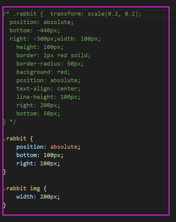
/* 小兔子图像 */
.rabbit {
/* transform: scale(0.2, 0.2);
position: absolute;
bottom: -440px;
right: -300px; */
width: 100px;
height: 100px;
border: 1px red soild;
border-radius: 50px;
background: red;
position: absolute;
text-align: center;
line-height: 100px;
right: 200px;
bottom: 50px;
}6
收起
正在回答
2回答

同学你好, “敲键盘侠”这位同学给的建议很棒哦, 可以将动画帧写成一个, 调整动画的时间和延迟时间, 简化代码书写
云朵的动画帧使用一个即可哦, 示例:
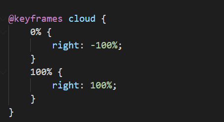
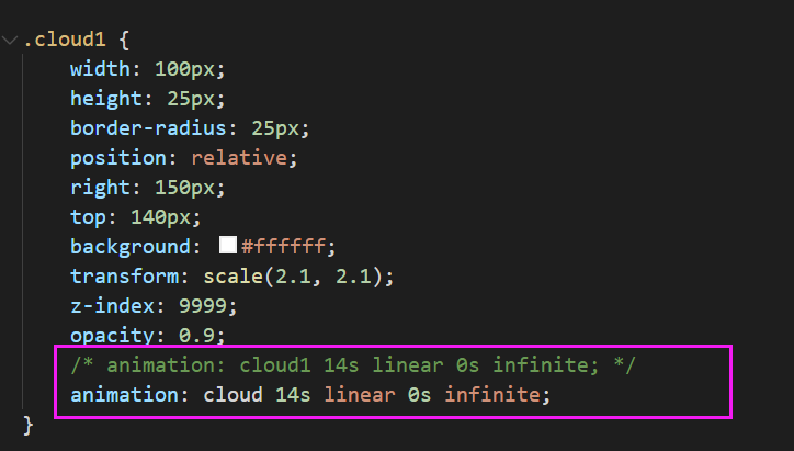
其他的云朵道理一样,修改动画的名称即可
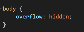
水平方向出现了滚动条, 建议: 可以给body添加overflow:hidden;属性,超出隐藏
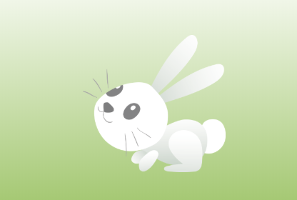
兔子可以引入图片
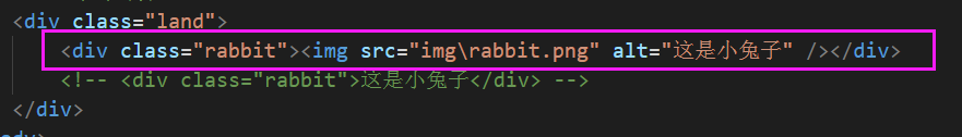
通过CSS设置样式, 可以给图片设置固定的宽度, 然后给外层设置绝对定位, 通过right和bottom属性设置兔子的位置
效果图:


同学完成作业之后,可以提交作业哦,批作业的老师会针对同学的项目给出详细的指导建议, 以稳当的详细发给同学,便于同学查看哦
如果帮助到了你, 欢迎采纳!
祝学习愉快~~~

相似问题


登录后可查看更多问答,登录/注册


恭喜解决一个难题,获得1积分~
来为老师/同学的回答评分吧
0 星