浮动与定位4-11自由编程作业提交
提交浮动与定位4-11自由编程作业,请老师过目
<!DOCTYPE html>
<html lang="en">
<head>
    <meta charset="UTF-8">
    <meta http-equiv="X-UA-Compatible" content="IE=edge">
    <meta name="viewport" content="width=device-width, initial-scale=1.0">
    <title>Document</title>
    <style>
        * {
            margin: 0;
            padding: 0;
        }
        .gallery {
            width: 1200px;
            margin:0 auto;
            text-align: center;
            margin-top:30px;
        }
        .gallery h2 {
            font-size:32px;
        }
        .gallery .skip {
            width: 60px;
            height: 3px;
            background:#07cbc9;
            margin:10px auto;
        }
        .gallery .text {
            color:gray;
        }
        .main {
            width: 1200px;
            height: 650px;
            margin:0 auto;
            margin-top:20px;
        }
        .main .up-pics {
            width: 1200px;
            height: 240px;
        }
        .subtitle {
            width: 1200px;
            height: 50px;
            color:white;
        }
        .subtitle dl {
            float: left;
            width: 360px;
            height: 50px;
            background-color: black;
            position: relative;
        }
        .subtitle dl dt {
            position: absolute;
            top:50%;
            margin-top:-12px;
            margin-left:20px;
        }
        .main .down-pics {
            width: 1200px;
            height: 240px;
        }
        img {
            float: left;
            display:block;
        }
        .main .up-pics .pic1 {
            margin-left:20px;
            margin-right:40px;
        }
        .main .up-pics .pic2 {
            margin-right:40px;
        }
        .main .down-pics .pic4 {
            margin-left:20px;
            margin-right:40px;
        }
        .main .down-pics .pic5 {
            margin-right:40px;
        }
        .main .subtitle .dl1 {
            margin-left:20px;
            margin-right:40px;
        }
        .main .subtitle .dl2 {
            margin-right:40px;
        }
        .main .subtitle .dl4 {
            margin-left:20px;
            margin-right:40px;
        }
        .main .subtitle .dl5 {
            margin-right:40px;
        }
    </style>
</head>
<body>
    <div class="gallery">
        <h2>GALLERY</h2>
        <div class="skip"></div>
        <div class="text">
            <p>Lorem Ipsum is simply dummy text of the printing and typesetting</p>
            <p>industry. Lorem Ipsum has been the industry's standard dummy</p>
            <p>text ever since the 1500s.</p>
        </div>
    </div>
    <div class="main">
        <div class="up-pics">
            <img class="pic1" src="03-01.jpg" alt="">
            <img class="pic2" src="03-02.jpg" alt="">
            <img class="pic3" src="03-03.jpg" alt="">
        </div>
        <div class="subtitle">
            <dl class="dl1">
                <dt>Science Lab</dt>
            </dl>
            <dl class="dl2">
                <dt>Indoor Stadium</dt>
            </dl>
            <dl class="dl3">
                <dt>Transportation</dt>
            </dl>
        </div>
        <div class="down-pics">
            <img class="pic4" src="03-04.jpg" alt="">
            <img class="pic5" src="03-05.jpg" alt="">
            <img class="pic6" src="03-06.jpg" alt="">
        </div>
        <div class="subtitle">
            <dl class="dl4">
                <dt>Kids Room</dt>
            </dl>
            <dl class="dl5">
                <dt>Meditation Classes</dt>
            </dl>
            <dl class="dl6">
                <dt>Kids Play Ground</dt>
            </dl>
        </div>
    </div>
</body>
</html>9
收起
正在回答
1回答

同学你好,代码存在一些问题:
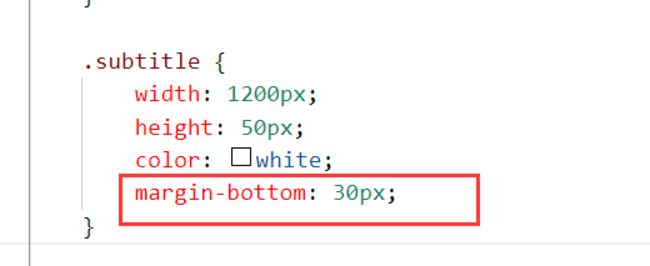
1、上下两组图文之间,缺少间隙:
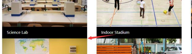
建议增加间隙,如下:
2、图文区结构划分不够优化,最好将图文划分成一组(整体),一共6组:
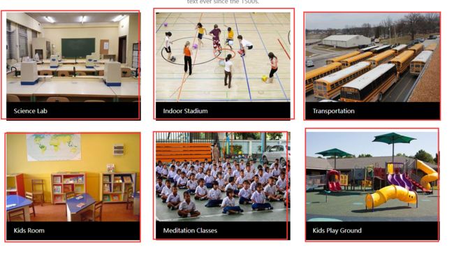
结构和样式,同学可以参考如下方案:
<!DOCTYPE html>
<html lang="en">
<head>
<meta charset="UTF-8">
<meta http-equiv="X-UA-Compatible" content="IE=edge">
<meta name="viewport" content="width=device-width, initial-scale=1.0">
<title>Document</title>
<style>
* {
margin: 0;
padding: 0;
}
.title {
text-align: center;
font-size: 32px;
}
.line {
width: 60px;
height: 3px;
background: #07cbc9;
margin: 10px auto;
}
.sub-title {
text-align: center;
color: gray;
font-size: 14px;
}
.gallery {
margin-top: 30px;
}
.gallery-content {
width: 1200px;
margin: 20px auto;
overflow: hidden;
}
.gallery-content dl {
float: left;
width: 360px;
margin: 15px 20px;
}
.gallery-content dt img {
display: block;
}
.gallery-content dd {
height: 50px;
line-height: 50px;
text-indent: 20px;
background: black;
color: #fff;
}
</style>
</head>
<body>
<!-- gallery -->
<div class="gallery">
<!-- 上半部分 -->
<div class="gallery-top">
<h3 class="title">GALLERY</h3>
<div class="line"></div>
<p class="sub-title">
Lorem Ipsum is simply dummy text of the printing and typesetting <br />industry. Lorem Ipsum has
been the industry's standard dummy <br />text ever since the 1500s.
</p>
</div>
<!-- 下半部分 -->
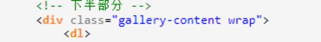
<div class="gallery-content wrap">
<dl>
<dt><img src="./images/03-01.jpg" alt=""></dt>
<dd>Science Lab</dd>
</dl>
<dl>
<dt><img src="./images/03-02.jpg" alt=""></dt>
<dd>Indoor Stadium</dd>
</dl>
<dl>
<dt><img src="./images/03-03.jpg" alt=""></dt>
<dd>Transportation</dd>
</dl>
<dl>
<dt><img src="./images/03-04.jpg" alt=""></dt>
<dd>Kids Room</dd>
</dl>
<dl>
<dt><img src="./images/03-05.jpg" alt=""></dt>
<dd>Meditation Classes</dd>
</dl>
<dl>
<dt><img src="./images/03-06.jpg" alt=""></dt>
<dd>Kids Play Ground</dd>
</dl>
</div>
</div>
</body>
</html>祝学习愉快!
相似问题


登录后可查看更多问答,登录/注册


恭喜解决一个难题,获得1积分~
来为老师/同学的回答评分吧
0 星