渐变做彩虹好丑。
<!DOCTYPE html>
<html lang="en">
<head>
    <meta charset="UTF-8">
    <meta name="viewport" content="width=device-width, initial-scale=1.0">
    <title>Document</title>
    <style>
        .ch1{
            width:380px;height:400px;
            position: absolute;
            top:0;left:0;
            background-color: purple;
            z-index: 1;
            border-radius: 50% 50% 0 0;
        }
        .ch2{
            width:340px;height:360px;
            position: absolute;
            top: 20px;left:20px;
            background-color: blue;
            z-index: 2;
            border-radius: 50% 50% 0 0;
        }
        .ch3{
            width:300px;height:320px;
            position: absolute;
            top: 40px;left:40px;
            background-color: green;
            z-index: 3;
            border-radius: 50% 50% 0 0;
        }
        .ch4{
            width:260px;height:280px;
            position: absolute;
            top: 60px;left:60px;
            background-color: yellow;
            z-index: 4;
            border-radius: 50% 50% 0 0;
        }
        .ch5{
            width:220px;height:240px;
            position: absolute;
            top: 80px;left:80px;
            background-color: orange;
            z-index: 5;
            border-radius: 50% 50% 0 0;
        }
        .ch6{
            width:180px;height:200px;
            position: absolute;
            top: 100px;left:100px;
            background-color: white;
            z-index: 6;
            border-radius: 50% 50% 0 0;
        }
        .ch7{
            width:380px;height:200px;
            position: relative;
            left:100px;
            overflow:hidden;
        }
        .ch8{
            width:600px;height:200px;
            display: block;
            overflow:hidden;
        }
        .ch9{
            width:600px;height:400px;
            background-image: radial-gradient(white 28%,orange 40%,yellow 52%,green 64%,blue 76%,purple 88%);
            border-radius: 50% 50%;
        }
    </style>
</head>
<body>
    <div class="ch7">
        <div class="ch1"></div>
        <div class="ch2"></div>
        <div class="ch3"></div>
        <div class="ch4"></div>
        <div class="ch5"></div>
        <div class="ch6"></div>
    </div>
    <div class="ch8">
        <div class="ch9"></div>
    </div>
</body>
</html>
问题描述:
渐变做彩虹太丑了。有没有更好的渐变做彩虹的方法?
14
收起
正在回答 回答被采纳积分+1
1回答

好帮手慕久久
2023-11-30 14:54:04
同学你好,这样实现是可以的。使用渐变做彩虹,可以考虑利用渐变颜色突变,改善效果,比如:
<!DOCTYPE html>
<html lang="en">
<head>
  <meta charset="UTF-8">
  <meta http-equiv="X-UA-Compatible" content="IE=edge">
  <meta name="viewport" content="width=device-width, initial-scale=1.0">
  <title>Document</title>
  <style>
    .box {
      width: 300px;
      height: 150px;
      margin: 100px auto;
      overflow: hidden;
    }

    .box div {
      height: 300px;
      border-radius: 50%;
      background-image: radial-gradient(50% 50%, white 0%, white 50%,
          purple 50%, purple 60%,
          blue 60%, blue 70%,
          green 70%, green 80%,
          yellow 80%, yellow 90%,
          red 90%);
    }
  </style>
</head>
<body>
  <div class="box">
    <div></div>
  </div>
</body>
</html>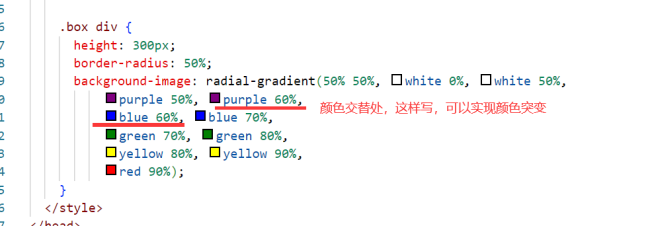
另外,并不是所有的效果,都可以用css实现,咱们这里重点锻炼思考能力、创新能力、代码灵活使用的能力,而非效果本身什么样。
实际开发中,一些好看的效果,大多会直接使用设计人员,做出来的图片,不用担心。
祝学习愉快!


恭喜解决一个难题,获得1积分~
来为老师/同学的回答评分吧
0 星